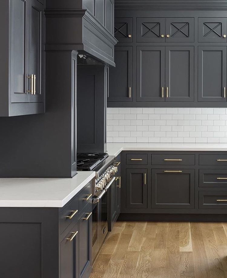
Cottage kitchen paint colors
Farmhouse Kitchen Paint Colors (Design Guide)
Welcome to our guide to farmhouse kitchen paint colors including matching paint with materials, accents & finishes and the best colors to use for your design
The beauty of farmhouse kitchen is its simplicity which has become synonymous with “classic kitchen style”. Its rustic touches, crisp white walls, open shelving, painted cabinetry, exposed beams and apron-front sink are making a huge influence and growing in popularity on kitchens styles nowadays.
We have outlined some guidelines on how you can bring in your own creative style, personalize your own color palette and adding colorful accents into your farmhouse kitchen.
Table of Contents
Using Neutral Colors For a Farmhouse Kitchen
Neutral in terms of interior designing refers to a balanced or unbiased style and so, it becomes a perfect strategy of using neutral colors in designing a room.
Neutral colors are sometimes called muted earth tones such as beige, ivory, taupe, brown, black, gray, and white. Keep in mind that these neutral colors have gradation and often have undertones.
Using neutral color pallets can have a light, airy, happy, and whimsical feel for a farmhouse kitchen.
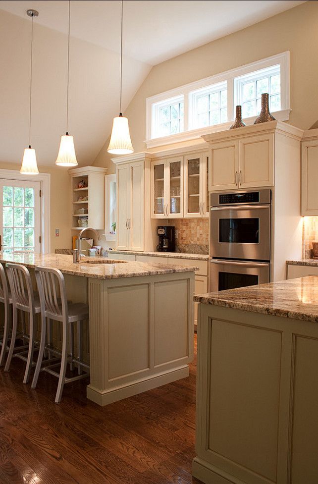
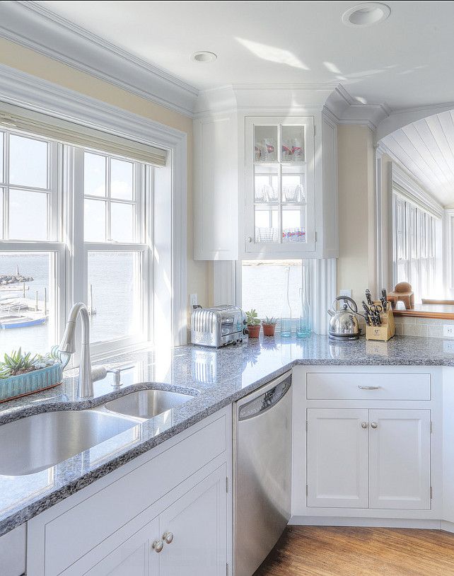
For a classic and timeless look, an all-white kitchen combined with wood-toned cabinetry and wood flooring is a simple, elegant, and perfect choice for a farmhouse style paint color scheme.
Also, try to layer different neutral tints or gradation of the same color for a classy and sophisticated look. Use your choice of neutral colors as background such as the walls of your farmhouse kitchen.
For a small kitchen space, a light neutral color would be a better choice. Incorporating a dark neutral color will help add dimension while still maintaining a calm and welcoming color palette.
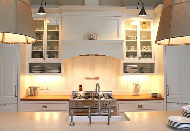
Matching Your Farmhouse Kitchen Materials & Finishes
There are a lot of design features that goes into designing a farmhouse kitchen to create a cozy, rustic and country feel that is a perfect fit for your home.
There is so much versatility and flexibility in style when creating a farmhouse kitchen, such as mixing the old classic style with the new and modern design elements.
Here are some must-have materials and finishes to create your perfect dream farmhouse kitchen.
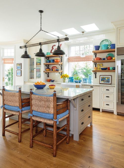
• Rustic architectural features such as exposed beams, hardwood floors will make your farmhouse kitchen have that natural classic look.
• Farmhouse sinks which is also called apron-front sink is an essential feature of any farmhouse kitchen. This beautiful porcelain sink which appears to drape over the base cabinets, also comes in different varieties such as dark or metal type to suit your design style.
• Farmhouse kitchen cabinets often feature solid wood for the main cabinetry or island and is an ideal element for this style.
Opt for simple cabinetry, stay away from cabinets with ornate door designs. A Shaker-style cabinet painted in white or neutral color such as cream, gray and beige create a perfect classic farmhouse look.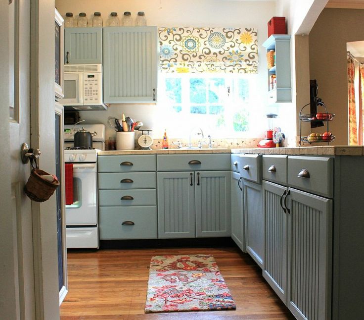
• Mix simple wood cabinetry with open or exposed shelving. A simple floating shelf or a hutch is both functional and stunning elements that will give your farmhouse kitchen a beautiful and rustic feel.
• Countertops materials should have a clean, smooth, subtle and simple look such as white marble and gray or black quartz. Another idea is to use reclaimed wood countertops to further enhance its rustic look.
Soapstone is one of the popular materials for a farmhouse kitchen because of its smooth, resistant and hard-wearing characteristics. It also gives a great contrast with the white and light shaded kitchen cabinetry.
A butcherblock countertop is a perfect material to use for a rustic-contemporary farmhouse kitchen due to its practical and durable qualities. It incorporates the natural wood material essential for a farmhouse kitchen design style.
• Another classic must-have features for a farmhouse kitchen design style are the beadboard and paneling. The crisp, simple and striped pattern of the wood paneling create a rich, charming and texture-filled farmhouse kitchen finish.
• By incorporating natural wood in farmhouse kitchen, for the floor, ceiling and backsplash; it adds traditional warmth to your kitchen.
For flooring, dark, rich hardwood is the best choice; you may also use engineered hardwood, vinyl or laminate. Ceiling beams or decorative beams can also be installed to give that farm or barn feel to your kitchen. Exposed wood or bricks for backsplash can offer a different rustic twist.
• Kitchen island is one of the essential furniture to use for a farmhouse kitchen – it can be a free-standing table turned island which can serve a double purpose of a worktop and dining table. Using wooden bar stools as seating for your kitchen island can also give a rustic charm to your farmhouse kitchen.
• Black matte hardware, copper and bronze on cabinets and drawers adds to the character of your modern farmhouse design theme.
• Stainless steel, oil-rubbed bronze, brushed nickel and gold finishes for hardware, faucet and other fixture finishes are the best to go with the farmhouse kitchen colors.
• Satin or semi-gloss paint are the commonly used paint finish for farmhouse kitchen since this two type of paint finish can withstand heavy-traffic area like the kitchen.
• Go for Vintage – for a classic farmhouse kitchen, incorporate some vintage accessories or vintage finds such as displaying ball jars, mason jars, glass canisters, antique vases, galvanized metals or large wooden bowls for a unique look.
On the wall, you can install wooden racks to store or display dinnerware, dishes, farmhouse vignettes, aprons or some period accessories collected over time.
• Adding natural textures to your kitchen such as covering windows with bamboo shades or use an alternative for the cabinet doors such as using a piece of linen or any fabric as skirt to cover the sink’s base cabinet. These materials give variation of texture and creates a casual feel for your farmhouse kitchen.
Best Farmhouse Kitchen Colors
Designing a farmhouse kitchen requires that the tone, style and colors coordinate perfectly to translate that welcoming, relaxed country feel of farmhouse kitchen to every homes.
Choosing the best colors for your farmhouse kitchen means finding the right balance and it is the perfect starting point. Colors are one of the essential elements that brings inspiration when designing your own farmhouse style kitchen.
Back in the old days of Colonial period in America, mixing paint with milk is used on furnishings and walls in order to achieve a unique, soft matte finish. This muted, soft, matte color finish became an integral element of the farmhouse style kitchen colors.
While white is the top choice for the farmhouse kitchen cabinetry, natural, neutral and muted colors will make the kitchen feel brighter, lighter and creates a warm and welcoming feel. These colors can provide a solid foundation and excellent background to any other color you would choose for your farmhouse kitchen.
This means incorporating ample amount of wood tone colors, beige, gray, and muted shades of blue, yellow and green will work well with wood and metal finishes.
Consider other elements and surfaces in your kitchen such as matching kitchen countertops with cabinets before you make the final choice in picking the paint color for your farmhouse kitchen.
Look for hues in the same group – cool colors and warm colors so that the tones of your new paint color will compliment with the other elements and surfaces in your kitchen.
Using Accent Colors and Textures for a Farmhouse Kitchen
The key to creating a cozy, chic and welcoming ambiance for your farmhouse kitchen is to add some accent colors and natural textures compatible to the farmhouse style design scheme.
• Accent colors can be incorporated in small portion of the wall paint for an accent wall or can be integrated in the accessories such as area rugs, bar stool for kitchen island seating.
It can also be applied on kitchen cabinetry either as a two-tone paint finish or feature an accent color on cabinets or other free-standing furniture.
• Colorful patterns in floor tiles or colored tile backsplash add colors into the kitchen.
• Wall art is one element to easily add to the neutral walls and gives a vintage character and charm to your farmhouse kitchen.
• Farmhouse kitchen ceiling can also be used as an accent feature by adding color such as muted pastels without darkening the room.
• For textures, incorporating metals such as copper, brushed nickel, antique brass or stainless steel is a perfect combination to the rustic and reclaimed charm of farmhouse style kitchen.
These metals can be featured in the form of kitchen appliances, faucets, hardware, lighting fixtures and furniture. Combining glass cabinet doors with a plain or shaker door allows colors to see through from the glass doors.
Enhancing Light
One of the signature element of farmhouse style kitchen is a fresh, light and airy atmosphere; and lighting sets the tone.
By incorporating doors and large enough windows which allows lots of natural light to come in, will help make the kitchen brighter and appear more spacious.
For dominant surfaces, consider using hues which are more lively colors and would give that positive and cheerful vibe.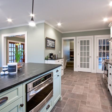 Backsplash with glossy finish will help reflect light as well.
For lighting fixtures, installing a lantern pendant lights or iron chandelier will give an antique and rustic look that feels elegant.
Pendant lighting type of fixtures offer more light in the cooking and dining area. It is also important to position lighting fixtures at the right spot since the direction in which the light shines is very important.
We hope that we have once again shared with you some very important and useful designing ideas on how to style and incorporate your own unique personality to your dream farmhouse kitchen.
At the end of the day, the best thing about farmhouse style kitchen is that it’s a warm, charming and welcoming place where all family members and friends love to gather and share wonderful memories together.
Paint Colors to Use for Farmhouse Kitchen
Farmhouse style kitchen color schemes tends to have neutral and earthy tones as the primary elements. These colors provide versatility and can go with anything. Neutral and earthy tones are excellent backgrounds to any other accent color and provide a solid foundation to any color scheme.
Here are some of our fresh take of paint colors to use for a farmhouse style kitchen for you to consider for your farmhouse kitchen project.
Rhine River by Benjamin Moore
This color is part of the Benjamin Moore Classic Color Collection, also known as Homestead Green AC-19.
Rhine River is a timeless and elegant hue which is a perfect choice for your farmhouse style kitchen. Use it best on your island cabinetry or accent wall, for just the right dose of accent color.
Stormy Monday 2112-50 by Benjamin Moore
This saturated warm gray neutral tone color gives out a bold and extraordinary feel that will excite and inspire designers and homeowners to create a striking farmhouse style kitchen.
Copper cookware and other accents in copper finish pairs well with this warm gray hue.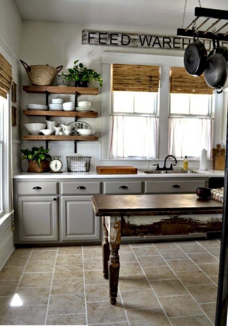
White Dove OC-17 by Benjamin Moore
This is a classic favorite paint color for farmhouse style kitchen due to its soft shaded white hue without the yellow undertone.
White Dove has a light and luminous effect which is an excellent choice for cabinetry molding, trim, doors and interior walls.
Mohegan Sage 2138-30 by Benjamin Moore
Perfect for a rustic farmhouse style kitchen this earthy forest green Mohegan Sage paint is like bringing nature in your farmhouse kitchen creating a moodier hue with its soft and muted tone.
A great choice for accent color for an island cabinet or for wall and base kitchen cabinetry paint color.
Swiss Coffee 12 by Behr
A very popular and favorite paint color for a farmhouse style inspired kitchen design.
When applied to the cabinetry, Swiss Coffee 12 has an off-white hue which gives a weathered and warm appeal especially when combined with wood flooring.
Dutch Tulip by Magnolia Home Paint
If you prefer a blushed color for your farmhouse kitchen cabinetry, Dutch Tulip is a good choice because of its warm soft peach tone which goes beautifully with brass finish hardware and other vintage design elements..jpg)
Maiden Hair PPG1106-1 by PPG
A joyful and welcoming paint color is courtesy of this muted, pale yellow color with a sunflower undertone.
This Maiden Hair yellow paint goes well with matte black fixtures creating a vibrant farmhouse style look for your kitchen.
Alabaster White by Sherwin Williams
This well-liked neutral paint color is a common background color in farmhouse style kitchen.
Alabaster white is an excellent choice for walls and interior trims since it gives the area a bright, clean, and crisp feel.
Sea Salt SW 6204 by Sherwin Williams
Becoming a popular choice of paint color, Sea Salt gives that cool and welcoming appeal for a farmhouse inspired kitchen.
While the color is cool it provide slightly warm undertones for a blue/gray paint that will look differently in each room depending on its lighting and decor.
Waterloo SW 9141 by Sherwin Williams
Looking for an earthy blue paint color? Try Waterloo by Sherwin Williams – this blue color has gray undertones which gives a soft and neutral tone and is a perfect choice for a farmhouse kitchen color scheme.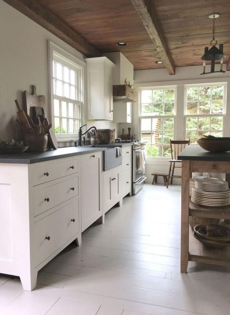
There are endless of neutral and accent colors to choose and to mix-and-match from different paint suppliers which can give your farmhouse style kitchen its unique and elegant color scheme.
We are just glad that we have share with you some of our best picks and hope that we have inspired you in finding paint colors that is perfect for your own farmhouse kitchen.
See more farmhouse kitchen ideas on our gallery page.
The 13 Best Farmhouse Paint Colors of 2022
Decorated Life is reader-supported. When you buy through links on our site, we may earn an affiliate commission. Learn More
Home Improvement
Painting
By: Sara Trimble |
When debating paint colors for the home, many people tend to limit their choices based on a design style, such as modern farmhouse, industrial farmhouse, or farmhouse chic.
The farmhouse style is heavily based on neutral shades of white, beige, gray, greige (gray and beige), and sometimes a few pops of dynamic color like reds, greens, or blues. These country paint colors create a comforting, family-friendly nuance that feels inviting and lived-in.
Farmhouse Paint Colors
The best thing about farmhouse-style is that the trend relies on simplistic and practical rustic charm. It’s the perfect choice for families since the more scuffed and worn out your stuff looks, the more it fits the farmhouse definition.
This list will look at 13 farmhouse interior paint colors you can use around your home, including warm (red, yellow, or cream undertones) and cool (green, blue, gray undertones) shades by top brands like Sherwin Williams, Benjamin Moore, and Behr.
Sherwin Williams Alabaster White
Perhaps the most popular farmhouse white paint color is Alabaster (SW 7008) by Sherwin Williams. This neutral white has a creamy soft base with faint yellow undertones that look more off-white in some lighting.
An LRV (light reflective value) of 82 means that Alabaster has a higher reflectivity, making spaces look more open and bright.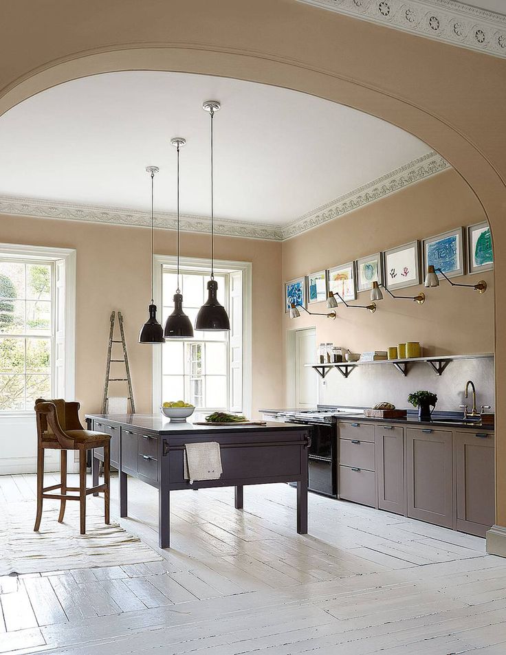 It’s the perfect choice for making smaller living rooms look bigger or creating a calming aura in the bedroom. You can even use this color for rustic kitchen cabinets.
Give your space more dimension to prevent the room from feeling stark and unwelcoming with a soft darker gray for the ceiling, such as Quest Gray (SW 7080). Then use a warm gray with subtle undertones of lavender and blue for the window trim, like Tinsmith (SW 7657).
Silverplate by Sherwin Williams
You can use farmhouse kitchen paint colors like a soft, cool, stormy gray for the walls. We love Sherwin Williams’ Silverplate (SW 7649) for its visual temperature – the color can look different in various lighting exposures.
This shade can look a stormy gray in southern light, while in northern lighting, it can have heavy blue undertones. A 53 LRV puts this color as a light-medium gray with blue-green undertones.
Finish the look with light-colored cabinets in a pale off-white like Nacre (SW 6154) and a lighter shade for the trim like Front Porch (SWA 7651), a soft gray with faint blue-purple undertones.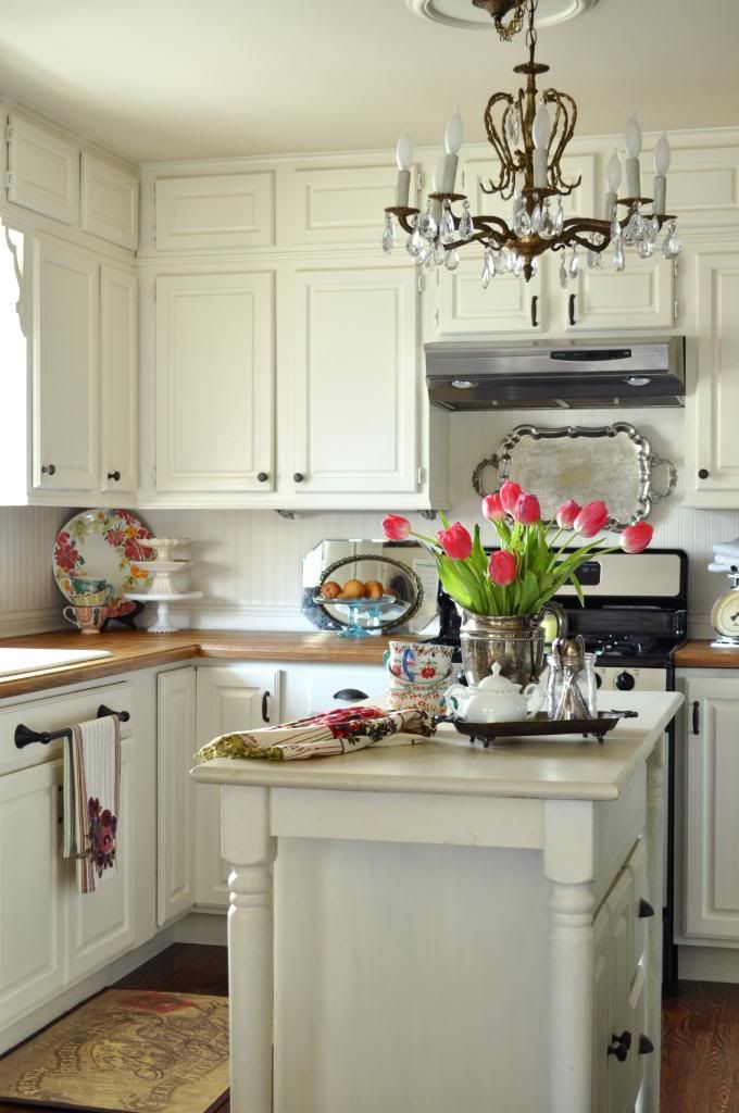
Sea Salt by Sherwin Williams
Sea Salt (SW 6204) by Sherwin Williams is the perfect shade for creating a soothing, relaxing bathroom retreat. But this gorgeous chameleon color can also look fabulous in bedrooms, laundry rooms, and mudrooms.
This soft, blue-green color is perfect for a beach-like, tranquil ambiance. Sea Salt can look gray in some lighting or around blues; when used around gray, it will look green. Or it can look blue next to a green. A 63 LRV gives this color some brightness without being too light.
Sea Salt makes an excellent pairing when combined with bright whites, like Extra White (SW 7006) – slight blue undertones – or High Reflective White (SW 7757), which is cleaner. But you could also go with off-whites like Greek Villa (SW 7551) or Alabaster (SW 7008).
Sherwin Williams Waterloo
Waterloo (SW 9141) is an earthy, neutral dark farmhouse blue paint with soft gray undertones that makes it versatile for multiple uses. This natural shade is cool with a subtle, soothing nuance and a low LRV of 13.
It looks fabulous for exterior use, paired with Alabaster trim and a lovely Mountain Air (SW 6224) door and shutters. But it might not be right to use in rooms with low lighting since it can cause your walls to look more closed off. This might be perfect for large rooms but not for small spaces.
Use coordinating colors like Warming Peach – (SW 6338), Rhinestone – (SWV 7656), or Malted Milk (SW 6057), or contrasting colors like Debonair – (SW 9139), Blustery Sky – (SW 9140), and Moscow Midnight – (SW 9142). Stark whites like Extra White or Pure White are perfect for trim.
Repose Gray by Sherwin Williams
Nothing screams farmhouse like a greige. We love Repose Gray (SW 7015) for its rich gray base with faint beige undertones. This neutral warm shade is the perfect color if you’re looking for one shade to use throughout the whole house.
We especially love the relaxing, romantic shade used in a farmhouse bedroom. The undernotes of blue and light violet become more prominent in rooms with a lot of natural or northern light and can turn this warm color cool.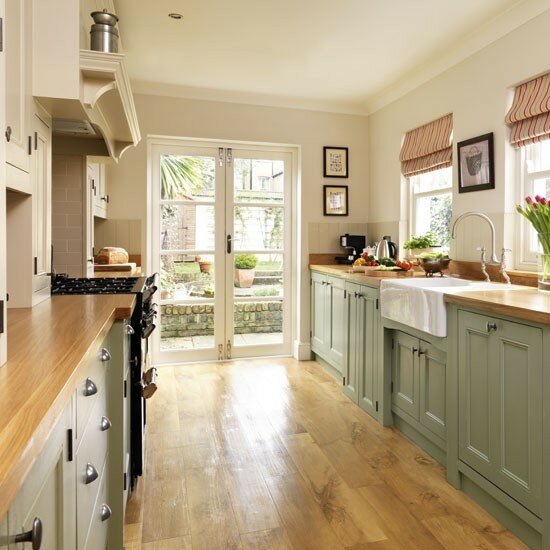
With a 58 LRV, Repose Gray is a lighter color that pairs well with Pearly White (SW 7009) for the trim and beadboard ceiling and an accent wall in Elephant Ear (SW 9168).
Puritan Gray by Benjamin Moore
Benjamin Moore offers a gorgeous farmhouse gray – Puritan Gray – that can look smokey blue in some lighting due to the lustrous darker hues and lower 33.71 LRV.
This shade falls into the trend for modern farmhouse paint colors consisting of stormy hues of gray with undertones of blues, greiges, greens, and purples.
It looks fantastic for entryways, paired with a blue door (try Cape Blue – 1642) and trim in an off-white with cool gray undertones (we love Steam – AF-15). Or you can use it for dramatic yet soothing bedrooms or bathrooms. It’s genuinely a shade you can use anywhere!
Wythe Blue by Benjamin Moore
For a farmhouse green paint with a light-medium gray base and blue undertones, we turn to BM’s Wythe Blue. This exotic chameleon color has a strong visual temperature (with a low LRV of 48), allowing it to change its look based on lighting.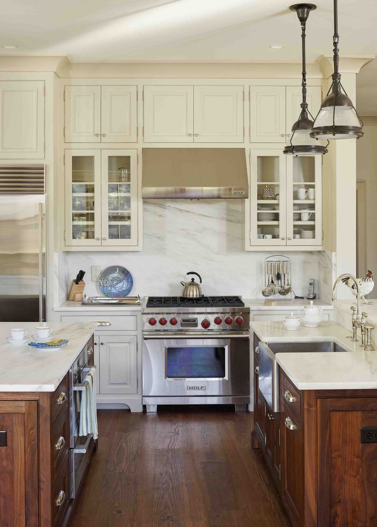
When there’s low lighting, this shade becomes more gray dominant with muted green and blue undertones – perfect for bathrooms. But in bright spaces with lots of natural light like family rooms or living rooms, this color can look more tropical with citrusy blue and green highlights.
Or you can give your kitchen a modern farmhouse feel by using this versatile color for cabinetry and the island with cool gray walls (Athena 858), light trim (White Dove – OC-17), and dark wood floors. It can also look incredible for the cabinets in the mudroom or laundry room.
Kendall Charcoal by Benjamin Moore
Another modern farmhouse color that can make a major statement is Kendall Charcoal (HC-166). This rich, luscious dark neutral has a greenish-grey tint that pops with color while keeping a dark, moody nuance due to a 12 LRV.
This color can stand out as your home’s exterior color or for interior use, as the color choice for your walls in the bedroom, office, or cabinetry in the kitchen, bathrooms, or laundry room.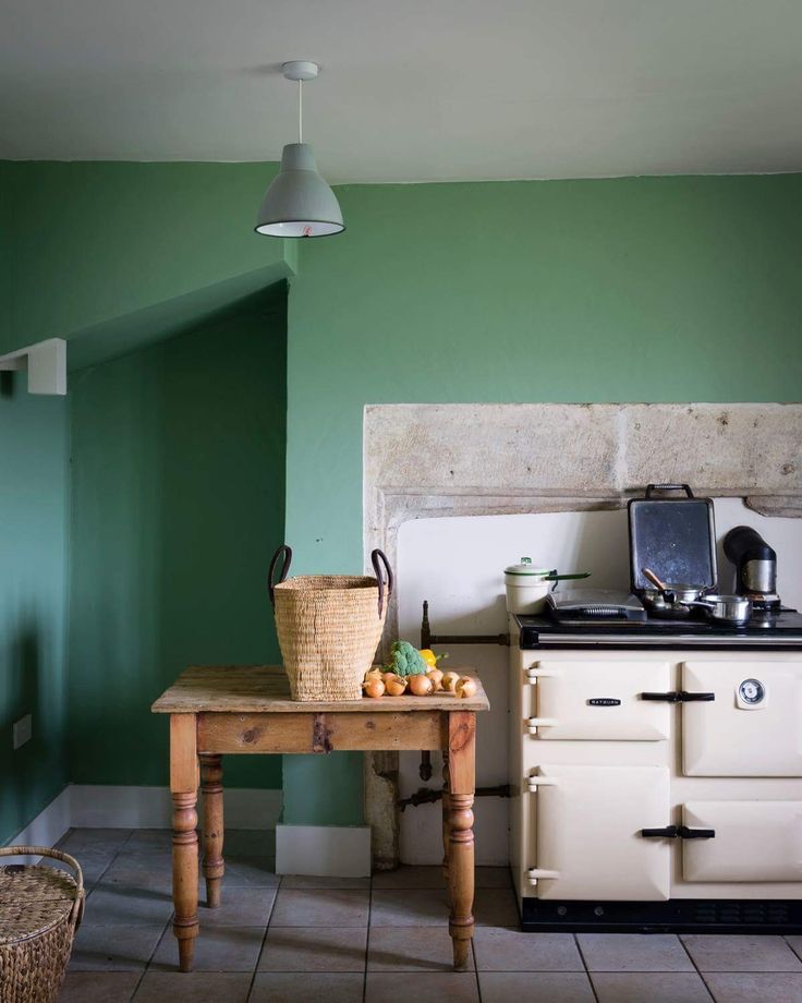
Plus, it can work for the wall color for small rooms or as a focal piece for an accent wall with light neutral trim (try White Diamond OC-61 or Metallic Silver 2132-60) and accents.
Benjamin Moore White Dove
For a soft, lightly-toned farmhouse white, try Benjamin Moore’s White Dove (OC-17). This bright white – LRV of 85 – color is a popular choice for trim, moldings, and cabinetry.
It can also work for walls, showing off a slight bit of gray undertones without looking like too much of a cream. Although if there’s too much light in a room, the color can look washed out.
Use White Dove for the trim throughout your home or for giving your kitchen a brighter, open feel. It’s also a soothing shade to use for bathrooms with a bluish-gray (Bunny Gray 2124-50) trim and a cool Winter Orchard (1555) for shiplapped ceilings.
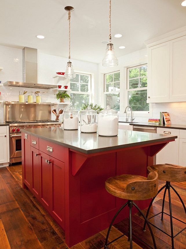
Million Dollar Red by Benjamin Moore
Farmhouse colors don’t have to be light neutrals like grays, whites, and creams. You can also go with something dramatic and country, such as Million Dollar Red.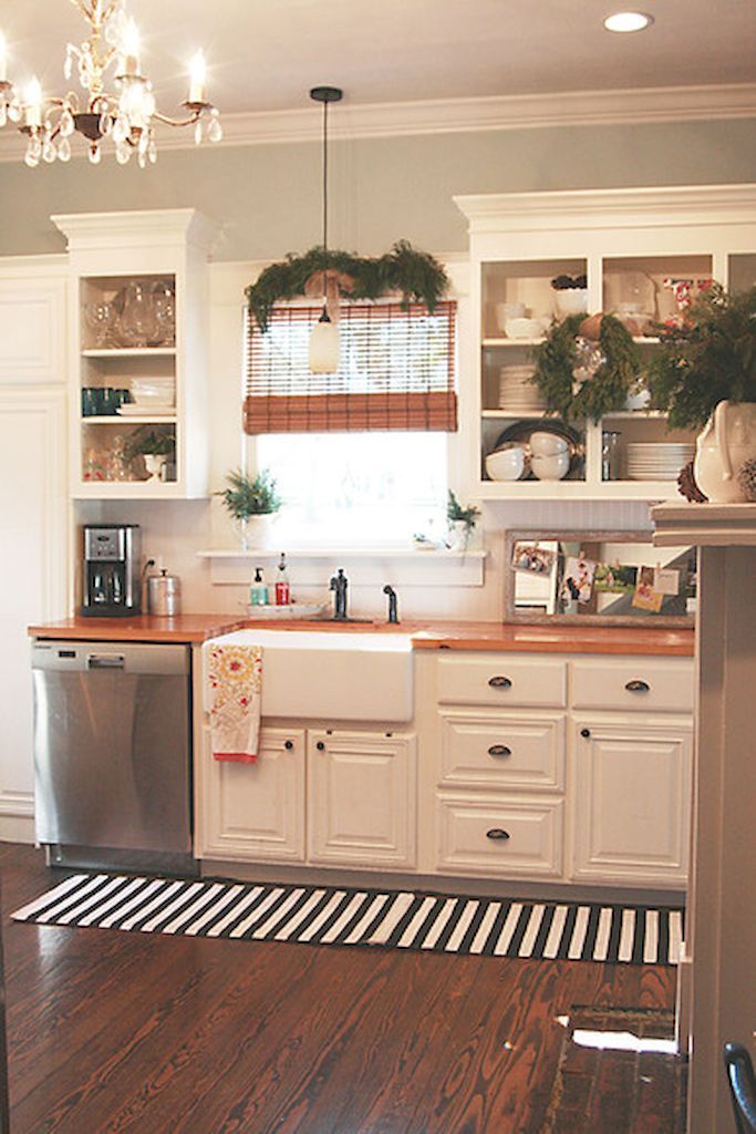
Now, this color isn’t something you’ll want to use in large commodities, and it won’t be suitable for all areas of the home. But it can make a fantastic accent wall or a stylish exterior door. And it can make for a bright pop of color in a home office to help energize and focus your mind.
This color’s low LRV of 10 means it’s a duller shade that absorbs light, so it probably won’t look right in small dark spaces. Pair with neutrals like Pure White (OC-64), Gray Cashmere (2138-60), or Distant Gray (2124-70).
Behr Sunken Pool
If you’re looking for a cool, icy blue with faint traces of gray with a higher LRV of 69, you’ll fall in love with Sunken Pool (S440-1) by Behr.
You can use this cheerful blue on your ceiling, for shiplap color, or as an accent color. We love it as the wall color for a classy laundry room.
Add some Roof Top Garden (S390-4) blueish-green cabinetry, Mayfair White (M390-1) for the trim, and paint the door Unwind White (GR-WO5) and you’ve got a farmhouse color palette sure to be the envy of everyone.
Behr Compass Blue
You can create a drop-dead-gorgeous farmhouse kitchen using neutral colors combined with one dominant bold shade, like Behr’s Compass Blue (MQ5-54), a darker blue with an LRV of 6. This shade looks fantastic for a kitchen island and lower cabinetry.
Then use a light neutral gray for your uppers – preferably open shelving – like Riverdale (N410-3), which can show lavender undertones in some lighting. Behr’s Flipper (another gray – PPU25-15) is a slightly darker shade.
You can use a lighter color for the trim, such as In the Spotlight (M570-1) or Unwind (GR-W05), two shades of off-white.
Behr Weathered Moss
Behr’s Weathered Moss (N380-3) is a soft, cool, medium-light shade of gray with green, blue, and yellow undertones.
This color looks fantastic in bright living rooms and blends well with complementary colors like Wheat Bread (720C-3), Riverdale (N410-3), or In the Spotlight (M570-1) for the trim and fireplace mantle.
It’s also a soothing color for bedrooms, kitchens, or offices.
Farmhouse Color Pairings
- Muted Navy
- Blush Pink
- Washed Taupe
- Mauve
- Creamy White
- Charcoal
- Butter Yellow
- Soft Wheat
- Subtle Silver
- Mink
- Matte Gold
- Distressed Beige
- Owl Grey
- Midnight Black
- Sage Green
Farmhouse Colors LRV – What is It and Why It Matters
One of the biggest things to consider when picking the right farmhouse paint colors for your home is the shade’s LRV.
LRV stands for Light Reflective Value and refers to how well the color reflects the light out to make a space look brighter rather than absorbing it.
Paint colors can have an LRV ranging from 0 to 100, where the higher the color’s value, the more reflective the paint. Conversely, the lower an LRV, the darker the color will look and the darker the space will seem.
To put this value range in perspective, a standard black has an LRV of zero, meaning it absorbs light and looks very dark. On the other hand, standard white has a value of 100, which means it reflects light into the environment, making the room look brighter and more open.
Use Samples to Narrow Down Your Color Choice
Picking the right color combination for your space can be a tricky task. Rather than make a quick decision on which color you want to use, it’s always recommended to take the time to see how multiple colors look side-by-side.
Give yourself a few days to live with the different shades, seeing how each color looks in various types of lighting, including little to no light and heavily lit with natural and artificial light sources.
One way to test your different colors is to paint test strips on your wall. But an easier and more convenient method is to use shades purchased from Samplize.
These 12” x 12” patches of paint peel and stick to the wall, making it easy to relocate them to different wall locations or examine various lighting scenarios.
Final Words
The Farmhouse trend can be modern, traditional, chic, or industrial, giving you a wide range of style choices.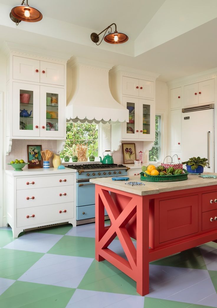 As this list shows, you can choose from many colors, from neutrals, grays, whites, and greiges to bolds like red, blue, green, and charcoal.
photos of ideas in different styles and layouts
Any colors that surround a person directly affect his mood, health, psychological state. It is very important to choose the right scale for the kitchen, because a lot of time is spent in this room. The photos presented in the article will help you choose what color to paint the kitchen - in addition, you need to take into account other design nuances.
Contents
- Color selection steps
- Psychologists' recommendations
- Choosing a palette, depending on the style of
- Nuances of choice of color
- Narrow kitchen
- Small kitchen and low ceilings
- large kitchen
- kitchen-studio
- Lighting and color
- color, changing the size rooms
Stages of color selection
First of all, you need to understand the scope of work, so before starting the design and choosing the color of the walls, it is important to study the recommendations of designers, psychologists, look at photos in magazines.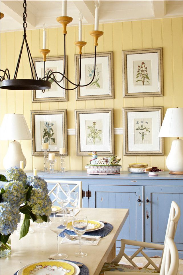 It is recommended to choose the 10 best options that you like and print them. After examining possible solutions, next steps :
- Kitchen style is defined. Having chosen the right ones, you will need to study all the subtleties, features and choose a shade.
- Decide what you like, not imitate fashion. If a certain color causes delight, improves mood, then you need to stop at it. It can be a base for walls or an additional color for a table, furniture and other kitchen accessories.
- Before buying paint, take some photos of the kitchen and show them to the consultant, he may recommend some good options.
- It is better to choose 3 colors from the entire range. They must match the style, fit the decorative elements, mood. If the kitchen is planned in warm colors, you can stay in a country-style kitchen, which will emphasize the details.
- When buying, you need to use not only a photo of your kitchen, but also a small list of possible colors, additional room accessories.
 Be sure to clarify the quality of the paint, its advantages and disadvantages.
After all the stages passed, you can proceed to the design and painting of the kitchen.
Recommendations of psychologists
Any color affects the psychological state of a person. Before choosing, you should read the recommendations of psychologists.
Experts do not advise using very colorful and bright colors, as they activate the nervous system. Depending on the temperament, psychologists advise using the following colors for the kitchen :
- Cholerics use juicy red or orange.
- Phlegmatic people are forbidden to use red and orange shades.
- Sanguine need to paint the kitchen yellow or light green.
- Melancholy will suit calm shades of white, blue, blue and brown. A similar range can be applied to phlegmatic people.
Those who love bright colors should know that red has a strong effect on the psyche - not only activates the body to action, but also increases appetite, so this solution may be required for people with anemia.
It is forbidden to use red for hypertension, unbalanced people and prone to sudden mood changes. The solution is not suitable for those who are always trying to lose weight.
Orange has similar qualities as red, but the effect on the psyche is softer. From such walls, the mood rises, the work of the digestive system improves. Green shades are good for digestion.
Psychologists also advise taking into account the area of employment, the main type of work. Since it will be quite difficult to be in a bright room during active everyday life.
Dark shades can negatively affect the mood of a person, in addition, they are not used in a small area. If dark colors are present, then they will definitely need to be diluted with softer, lighter ones.
Black, brown paints are rarely used for the kitchen, because they make it visually small, creating the effect of constant dirtiness. Such a decision can impair appetite, affect mood.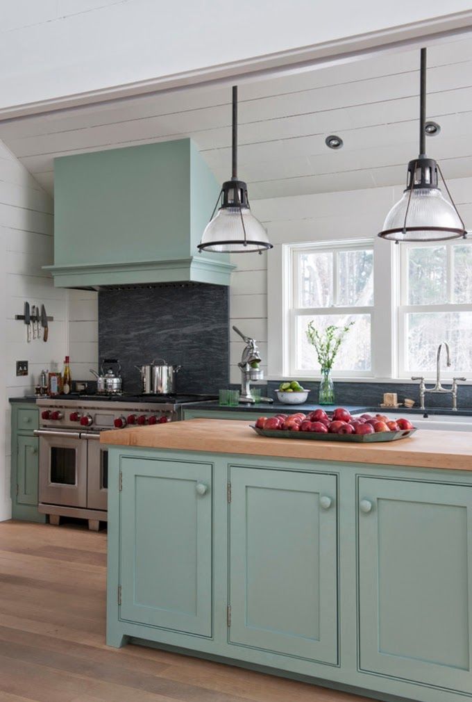
Tires and irritates any person too bright and saturated colors, warm shades give cheerfulness, and cold ones can soothe.
A choice of light colors can enliven the design, dark ones will make the kitchen discreet and calm.
Choice of palette depending on the style
It is very important to decide on the style when choosing the color of the kitchen walls. For understanding, you can choose several options at once and attach samples to the walls. Based on the style of the kitchen, the selection of colors is simplified:
- white and light blue are suitable for the Scandinavian interior ;
- for the mediterranean style milk, olive, cream are suitable. It is recommended to use light wood with cold tones;
- for chalet yellow, brown is suitable, and furniture can be made of dark wood;
-
- techno style implies the use of steel gray;
- modern interior involves the use of white and gray, cream or light brown;
-
-
- for the English style use rich autumn colors;
-
-
-
- country is characterized by milky, straw and light brown walls.
 On the other hand, with neoclassicism purple, black and gray colors are used;
- country is characterized by milky, straw and light brown walls.
-
-
-
- for high-tech steel is suitable, more light and gray shades;
-
-
-
- classic interior is combined with a pale pink shade, rich beige or blue.
-
General rules include:
- a small kitchen is painted in light colors and tones, with a large area, dark colors are perfect;
- gray can depersonalize a space;
- if there is little light in the kitchen and it is dark, then it is better to use a warm color scheme;
- Wall painting in the kitchen is based on the type of furniture. If the kitchen facade is dark, then it is recommended to make the walls light or add white decor;
- brown walls narrow the room and negatively affect appetite;
- color is recommended to be selected according to age, bright colors and contrasting elements are suitable for young people.
Psychologists and designers do not recommend using pure green for kitchen walls, it is better to choose several shades and combine them with yourself. A similar rule applies to yellow, pastel or red copper.
White is a universal and suitable color, which, with the right combination, will make a beautiful room and suit any style.
The nuances of choosing a color
When choosing a color for kitchen walls, designers recommend taking into account many different features, including layout, lighting, area and other factors. Be sure to take into account the furniture, its type and location.
Narrow kitchen
Wall color for a narrow kitchen should be light, furniture and paint should be selected in different shades. Among the options are:
-
-
- with white furniture, paint the room in gray light colors;
- blue decoration is added to white furniture for more space;
- sand furniture is combined with light green walls;
- creamy or creamy base to complement wood furniture;
- green shades of the set match beige walls.
-
When choosing a bright color, you can paint only 1 wall, which is located on the other side of the doors. It is forbidden to use paints in a narrow kitchen in 2 levels.
Small kitchen and low ceilings
The combination of colors in such a room must be properly chosen to make the kitchen cozy. To do this, you need:
-
-
- apply paint directly to the ceiling and go a little on it;
- make vertical stripes on the walls to visually lengthen the kitchen;
- paint the ceiling in light cold shades, excluding white;
- painting is ideal.
-
Circular designs, borders or two-tone painting are excluded.
Large kitchen
Very light and cold shades should not be used in such rooms. Orange, coral, cherry or purple work well. It is important to consider the following rules:
-
-
- light wood furniture is combined with cream and apricot on the walls;
- abundance of glass and metal will suit any shade of red, pale violet or raspberry can be applied;
- even white walls are suitable for dark furniture, but sand and light green colors will be favorable;
- with bright furniture, paint the same color with a different tone for the walls.
-
Using purple, you need to choose it correctly and make the best combination. They quickly get tired of such a decision.
Kitchen-studio
When designing a kitchen-studio, it is important to maintain not only the overall style of the interior, but also the same range of colors with different shades. For decoration it is better to use 3 colors:
-
-
- bright;
- light;
- contrast or white in any shade.
-
Use bright solutions for one wall in the room, paint everything in the same color in the living room area.
If you have light brown furniture, you can make one wall light green and two white; in the living room, paint it with a pale light green tint. In this case, only light furniture should be placed in the living room. Modern and beautifully combined kitchen-studio in red and white.
If the walls in the living room are covered with wallpaper, then in the kitchen you need to paint with a similar shade, but it is better to use wallpaper too.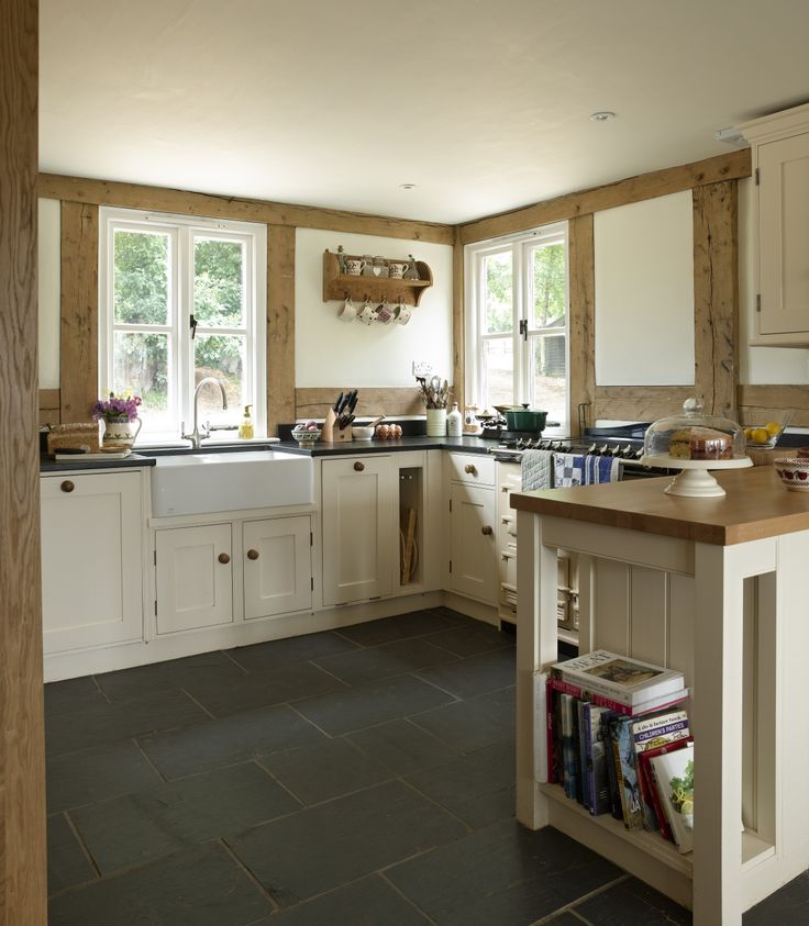 The use of different shades of the same color is well combined, but apply a light range in the living room, dark in the kitchen.
Lighting and color
Selection of gamma directly depends on the illumination of the entire area. If the kitchen is located on the north side, then there is little natural light, you should give preference to soft yellow paint, golden, sand or cream.
For large areas, red and orange can be used, and yellow will give the illusion of sunlight. Apply bright shades only on one wall and preferably in the darkest part, this will make the room soft and pleasant.
If the side is sunny, then cold shades are suitable, blue, green, marine colors are allowed. They can be combined with soft tones or create a contrast by adding yellow to green or blue and gray to red.
In bright rooms, it is better to use glossy paint so that overflow and glare appear when illuminated.
Important parameters
The walls in the kitchen create a background for the overall style, so it is important to understand the basic rules:
-
-
- Use light colors to visually expand the room.

- For a small kitchen, avoid the dark range, it narrows the area.
- If the area is small, do not use bright colors.
- For a large space, use warm shades, because cold ones visually enlarge the room, and there is a feeling of empty kitchen, facelessness begins.
- Use light colors to visually expand the room.
-
On the building and finishing materials market, you can buy any color of paint, different textures. When repairing, you do not need to chase fashion trends.
Chestnut color and black paint are often used these days, but this is not the best option for kitchens. Such a decision will reduce the room, make it gloomy, even with good lighting. In addition, dark gamma can negatively affect a person's mood.
Studying photo ideas for kitchens, you can see that not only walls, but also the ceiling can be painted. Many are accustomed to white color, with an even structure, but in the presence of height and area, it is recommended to do it in several levels using drywall.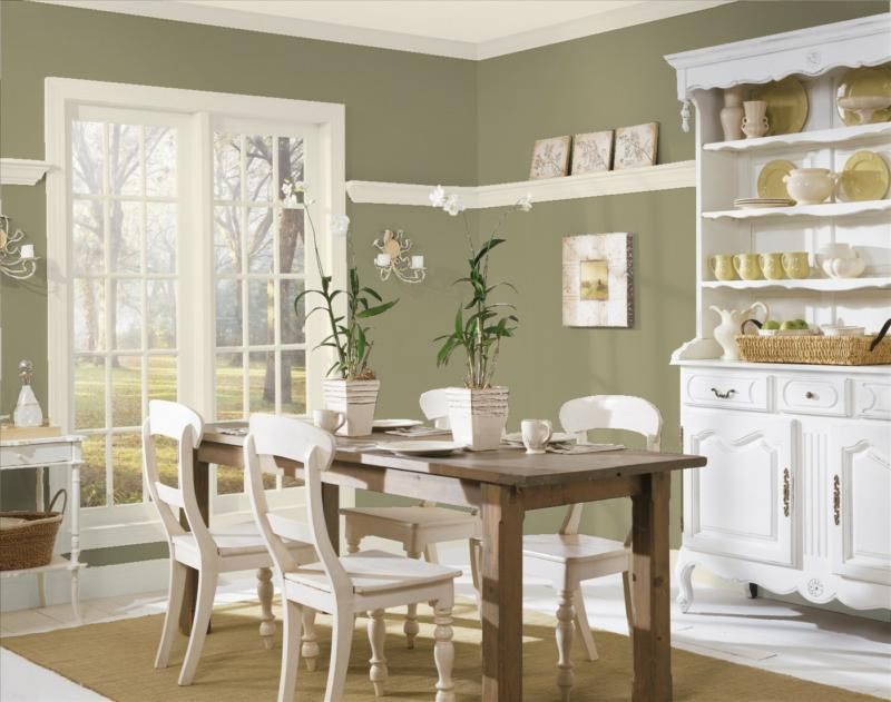
Film stretch ceilings are a great idea. Both options are combined and painted in different colors.
For a small space with a low ceiling, it is important to stick to the classics in white or pastel colors to visually expand the space. Light gloss is suitable for stretch ceilings.
Color that changes the size of the room
It is important not only to choose the right color for the walls, but also to take into account the range of additional details. A lot of space is occupied by furniture, which is the main part of the kitchen. When choosing the color of the walls, the range of furniture is taken into account. Basic requirements to follow:
-
-
- The classic brown version is suitable for white, beige and pastel walls.
- For white furniture, it is better to use any shades of red, burgundy, peach, green, blue and yellow. This creates contrast and a great effect.
- To create an accent on the furniture, the walls should be painted in pale and muted colors.
- For original furniture, use calm colors on walls that will not be bright.
- Light set stands out against the background of bright, saturated paint.
- For country style, Provence, pale green, beige or lilac walls are suitable, you can use the color of brick.
- Hi-tech style complements a calm background that is conservative.
-
When choosing a finish, it is also important to follow some rules:
To simplify the choice, it is recommended to familiarize yourself with the video, which provides detailed information on painting the walls in the kitchen and choosing a color palette:
Kitchen interior design. The ideal arrangement of the kitchen.Issue #1
Watch this video on YouTube
The described rules are only basic, each house has an individual design and style, and the tips presented will help you show your imagination and make a choice.
Like the article? Tell your friends about it:
Kitchen design in the country house + photo
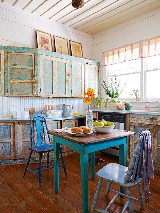
rustic style
The design of a country house does not receive as much attention and money as the design of an apartment. They do not spend much time here, but usually live in the summer and sometimes come in the fall and winter. Therefore, it is a pity to spend a fortune on a dacha that has been used for several months, weeks. Often, country houses are located in poorly protected areas. These factors force to save on arrangement, design. The dacha is often equipped with old furniture.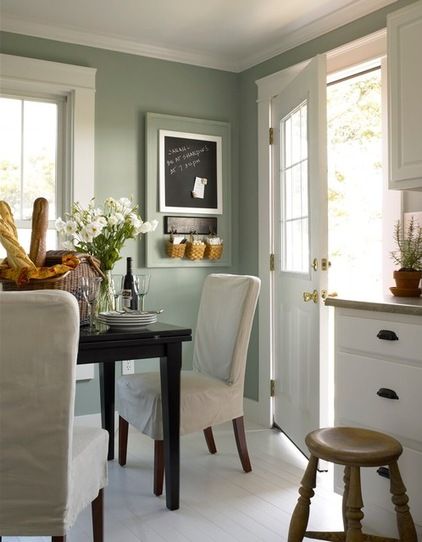
The dacha, located in a protected area, is used for living and recreation much more often. Then the design is given more attention. How to equip the main room of the cottage - the kitchen? How to design the interior of a country house kitchen in different styles?
When renovating a dacha, they usually do not spend a lot of time on careful finishing, design using expensive materials, furniture. Summer, the sun outside the window is a sufficient reason to equip a summer dining room in the country, allowing you to enjoy free moments of relaxation spent with your family. Family lunches, dinners are more pleasant to spend on a cozy terrace, veranda. Below are ideas for designing a kitchen-dining room in a country house.
Country house kitchen design, photo
Wall and floor decoration
Kitchen-living room design in a country house should start from the background – wall and floor decoration. The floor needs to be updated, painted, and the walls are available in different finishes.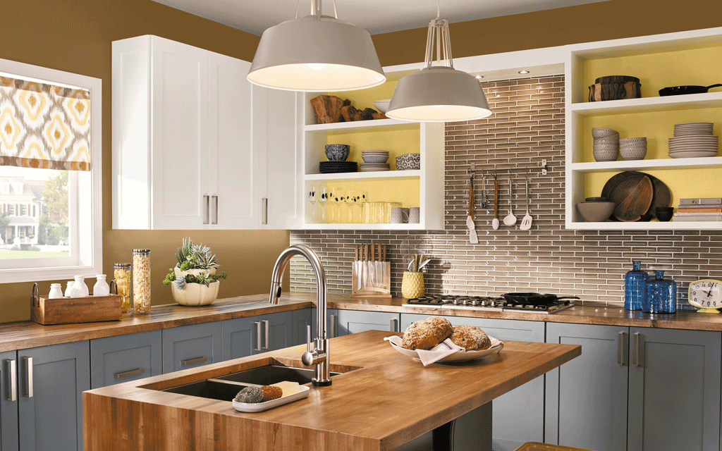 The walls of the kitchen should be covered with paint that is pleasing to the eye, preferably light. The paint must be chosen correctly:
- a cool shade will add freshness to the interior,
- a warm tone - warmth, comfort.
A house designed for summertime, when it is hot outside, it is desirable to decorate it cooler. Some cold tones should be added, instead of white, you can choose:
- baby blue;
- green;
- pink;
- classic ecru.
The work surface should be covered with ceramic tiles, not necessarily expensive ones. The design of the tiles must be selected according to the image of the kitchen. Popular tile options:
- wood effect,
- brick effect in white, red.
If there are tiles left from the renovation of the apartment, and individual tiles have the same format, you can apply the trendy style of patchwork tiles. This solution will become a stylish, original accent.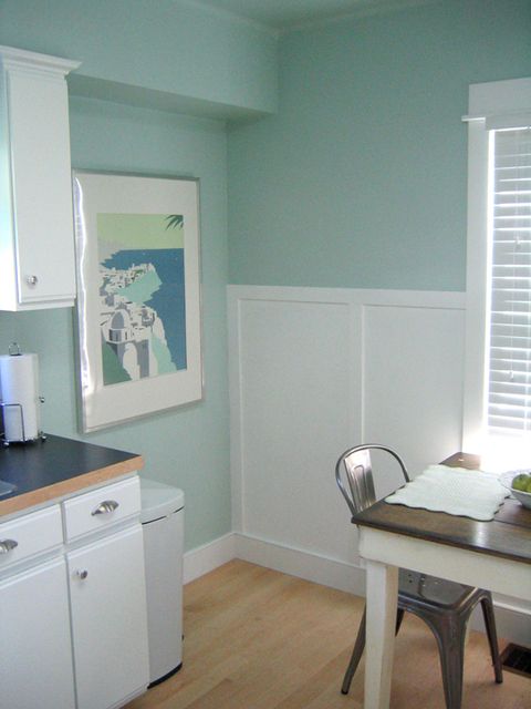
A kitchen in a country house, photo
Fashionable brick provides interesting possibilities. Instead of traditional cabinets, handmade shelves can be placed between the brick walls. This is a popular option for decorating a country interior in a rustic style.
Choosing the style of the interior
The kitchen should become a unique room where the family and guests will feel comfortable and enjoy spending their leisure time. The dining room on the terrace must be stylistically coordinated with the interior design of the cottage.
The most commonly used way to furnish a summer kitchen-dining room is rustic style. However, it is fashionable to design in the following styles:
- Provence;
- shabby chic;
- Scandinavian;
- retro.
Regardless of the style, a beautiful table decoration is a vase of cut flowers, carefully selected tablecloths, napkins. Cute decor elements will complement the climate of a cozy dining room:
- lanterns;
- baskets;
- drawers;
- candles;
- rocking chair.
Small touches will help create the atmosphere of a family holiday. Consider the options for kitchen design in more detail.
Scandinavian kitchen-living room - design, photo
Scandinavian style includes the following elements:
- light walls, floor, ceiling;
- white painted and unpainted wooden furniture;
- decorative wooden elements;
- wicker chairs;
- abundance of greenery.
Light paint on the walls, floor, ceiling will make the kitchen lighter, visually more spacious. There will be no problems with the selection of furniture, it is enough to paint the old furniture with white paint and the new stylish interior is ready. It remains to buy a wicker rocking chair, rattan chairs. The center of the kitchen will be a massive wooden table. Wicker, wooden or simple white plastic chairs are placed around the table - they will be an excellent element of the Scandinavian interior.
You can do a lot on your own.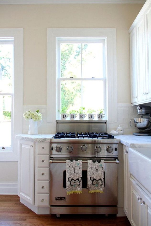 For example, it is interesting to decorate a Scandinavian interior with homemade furniture:
- furniture from pallets, boxes,
- benches made by hand,
- table from an old tree stump.
Stylish touches that give the kitchen a Scandinavian touch:
- wooden utensils;
- white crockery placed on shelves;
- bread in a basket;
- wooden fruit tray;
- colorful sofa cushions.
Let's not forget about greenery. Scandinavian interiors abound with fresh flowers, cut flowers in vases. Even seedling bushes on the windows will bring the necessary flavor!
Interior in Provence style
Provence style is similar to Scandinavian style, however, it is more cozy and feminine. Characteristic style elements:
- white walls, floor;
- abundance of wooden furniture, accessories, painted in white, bleached tones;
- The wooden beams on the ceiling emphasize the atmosphere of a French farmhouse.
Furniture can be artificially aged. Provence furniture is decorated with carvings. Vintage chests of drawers, retro cabinets can be found in the attic, purchased from junk dealers and painted the kitchen with white paint with your own hands.
Provence kitchen design of a country house, photo
Appropriate textiles will help create the atmosphere of a French village:
- checkered and white linen and cotton curtains;
- napkins;
- tablecloths decorated with lace.
Particular attention should be paid to the choice of textiles, preferably natural fabrics:
- linen,
- cotton.
Provence is impossible without flowers and greenery. Dried bouquets of lavender and other dried flowers placed in vases on the shelves look perfect.
Provencal kitchen-dining room, design, photo
Cute Provence in a house with wooden walls, photo
Country house
Country house is easy to furnish in a country style.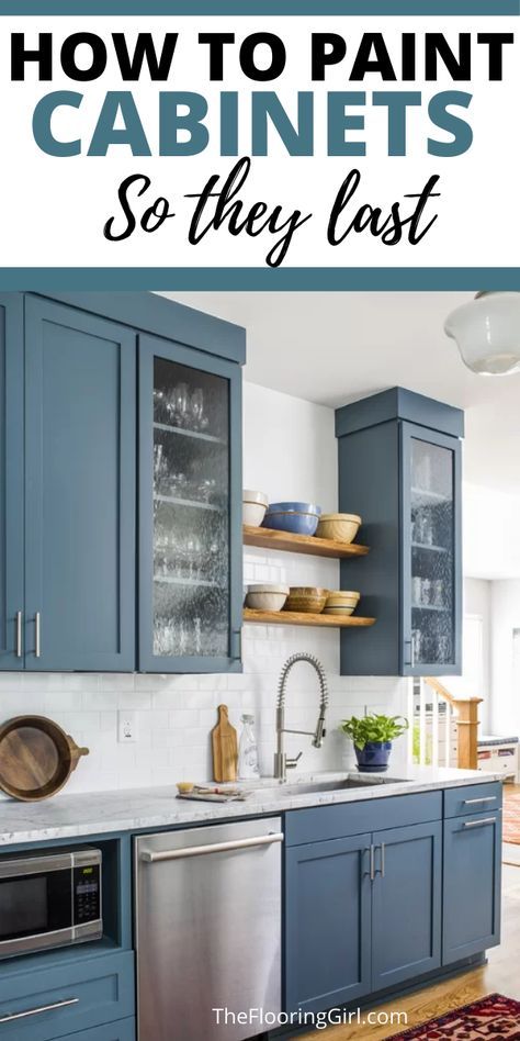 This style looks best in country interiors. For the kitchen you need to choose light spring colors. Yellow-green color will make the interior of the dining room saturated with sun, climatic. Rustic kitchen will be beautifully decorated with old furniture, paintings.
The rustic interior gives enough freedom of design, you can use different items stored in the closet, giving old gizmos a second life. Even the obvious inconsistency in a rustic space will add charm.
Lovers of rustic style will certainly want to introduce folk crafts - embroidery, ceramics. The walls, shelves of the living room can become a real exhibition of the works of needlewomen. The floors are decorated with home-made carpets, tables, chests of drawers - napkins with embroidery, hand-knitted.
Photo. Kitchen-living room - interior design in a rustic style The country kitchen necessarily contains a massive table covered with a checkered tablecloth, on which there is a kettle, a candy bowl, fruit dishes, fragrant pastries. Ideally complement the composition of the grandmother's sideboard, which flaunts plates, cups, retro ceramics.
The composition will be complemented by wicker baskets with apples on the windowsill, mixed with sprigs of mint and thyme. Windows should be decorated with white curtains.
A modern rustic kitchen can look modern in terms of the necessary equipment and technology. Manufacturers of household appliances offer a line of products designed in retro style - stoves, oven hoods, retro refrigerators. When designing decor, make the most of the rich resources of rustic style.
- Solid wood table . The central point of the kitchen is the table. Family members and guests gather here, have long conversations over a cup of coffee, dumplings are made by the whole family, in the evenings everyone gathers, playing with children. It is advisable to purchase a wooden table, of a rather simple form, possibly equipped with a drawer. Wooden benches, simple wooden chairs will ideally complement the dining room.
- Sideboard . An antique sideboard is used for storage, display of dishes, attractively presenting beautiful dishes, tea sets. It is advisable to choose a wooden sideboard, decorated in a rural atmosphere.
- Additives . Important elements of the rural interior are colorful additions: ceramics with folk motifs, milk jars, bowls, trays, wooden trays, bread boxes, wicker baskets, porcelain with folk motifs, handmade tablecloths.
Eclecticism - modern ideas
Designing a kitchen in a modern style is not difficult, but additional costs will be required - the purchase of new furniture with smooth facades, modern textiles. An alternative solution is an eclectic style, which consists in combining elements of different styles. Eclecticism combines, for example, new furniture and antique appliances or a loft-style sliding door.
A modern cottage kitchen can have charm. Randomly assembled chairs can be placed around a simple rectangular wooden table.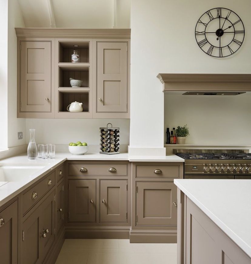 The sequence of choice of colors, textures will make the interior pleasant, harmonious, atmospheric.
Minimalism
Do you like minimalism? Minimalistically designed cottage will require a minimum of furniture. A spectacular decor instead of paintings, posters will be a beautiful view from a huge window. Interior design does not require significant costs. The emphasis is on light colors, the absence of an abundance of decor.
Outdoor summer dining
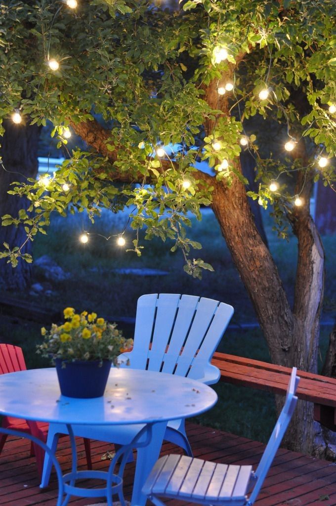
When furnishing a cottage, you should take care of dining outdoors - in the garden, on the terrace. Recreation among nature together with loved ones, a family holiday in a pleasant natural environment will provide an impressive dining room on the porch of the cottage.
Conclusion
Many people prefer to spend holidays, weekends in nature - to relax, unwind, turn off the phone, get away from everyday duties, leave the city, enjoying the nature surrounding the cottage.