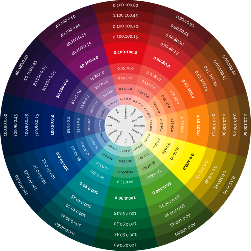
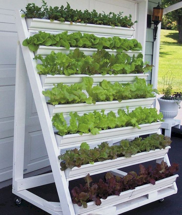
Colour wheel decorating ideas
Home Color Palette + Easy Color Hacks
This post contains affiliate links & photos. See our full disclosure here.
In this post: Color is one of the easiest and most effective ways to change the look of any room. Learn the basics of color in interior design, how to use a color wheel, the difference between color schemes in interior design and home color palettes, as well as how and where to use color in your home.
Color in interior design is a powerful tool. When you choose the right colors, you can make a space feel lighter, friendlier, more glamorous, more elegant, or whatever feeling you want to achieve. And when you create a whole home color palette, especially if you use a color wheel for decorating, your home instantly looks more pulled together and stylish.
Table of Contents
What Is Color?
“In physics, color is essentially the way our eyes and brain perceive different wavelengths of light reflected off objects.” [source]
Color is one of two key ways that you can create beauty and cohesive flow in your home decor. (Finding your style is the other.)
What are the basic colors?
Most of us remember back to kindergarten and maybe painting at an easel. Well from that you may remember the 12 colors on the color wheel. Just in case you don’t, they are:
- 3 primary colors – red, blue, and yellow.
- 3 secondary colors – orange, green, and violet (or purple)
- 6 tertiary colors – yellow-orange, red-orange, red-violet, blue-violet, blue-green and yellow-green
Different colors have different meanings, can influence our creativity and productivity, and create different emotions and moods.
Color psychology is the study of colors in relation to human behavior.
Put simply, the colors we use in our homes can affect how we feel and how we act. So it’s important to choose the colors we use wisely.
The psychology of color in interior design
Here are a few common colors and their positive and negative emotions and connotations.
Pink
Positives:
energetic, feminine, love, romance
Negatives:
immature, girly
Red
Positives:
stimulating, energetic, action, drama
Negatives:
irritable, angry
Orange
Positives:
joyful, happy, sunny, creative, stimulating
Negatives:
pessimistic, hyperactive, superficial
Yellow/Gold
Positives:
optimistic, happy, bright, cheerful, alert, sunny, powerful
Negatives:
tough to get a good shade of yellow
Green
Positives:
calming, balanced, harmony, life, freshness, stability, peace
Negatives:
ambition, greed, jealousy
Blue-Green
Positives:
serenity, tranquility, softness
Negatives:
impractical, idealistic
Deep Blue
Positives:
peaceful, cooling, quiet, powerful, rich
Negatives:
withdrawn, depressive, frigid
Purple
Positives:
power, luxury, elegance, creative
Negatives:
sad feelings, frustration,
immaturity
Grey/Silver
Positives:
glamorous, prestigious, sophisticated
Negatives:
emotional, sensitive, mysterious
Black
Positives:
strong, elegant, formal, mysterious
Negatives:
fear, grief
White
Positives:
light, innocent, cool, clean
Negatives:
sterile, associated with hospitals
Brown
Positives:
safe, secure, comforting
Negatives:
restrictive, barren
What is Color Theory
Color theory dates back before even Leonardo DaVinci’s time. Color theory in interior design is the study of colors and how to use them in harmony in your home to create the flow and atmosphere (feel) you want your home to convey.
Why using color theory in interior design is important
The colors you use in your home should not be chosen individually, in isolation, but rather with your entire home in mind. They should coordinate and they should assist in achieving the feelings you want in your home.
Color theory in interior design terms
Sometimes you need to explain things a little more than just saying “it’s red” or “it’s blue”. Here are a handful of words that will help you when talking or reading about color theory.
Hue: Another word for color
Tint: Adding white to a color
Tone: Adding gray to a color
Shade: Adding black to a color
Cool Colors: Greens, blues, and violets
Warm Colors: Reds, oranges, and yellows
A color scheme in interior design is essentially a framework for choosing your specific color palette.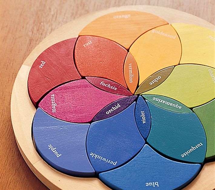
The four main color
schemes in interior designMonochromatic. One-Color Scheme – also called monochromatic – this color scheme uses any one color and all of its shades, tints, or tones. This scheme is very easy to implement and is a good place to start if you are unsure of yourself and your color choice, or if you like a subdued and subtle look.
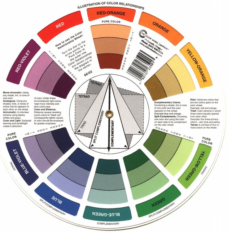
Complementary. Two-Color Scheme – also called complementary, this color scheme uses any two colors that are directly opposite each other on the color wheel. This scheme is typically a high contrast look with colors such as red and green or orange and blue.
Split-Complementary. Multi-Color Scheme – also called split-complementary, with this color scheme you choose one main color and then the two colors on either side of its opposite. It offers rather a dramatic look.
Analogous Related Color Scheme.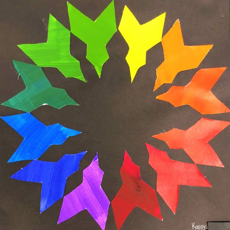 Also called analogous, this color scheme uses one main color and up to six neighbors next to it on the color wheel. A fun color scheme, best used with the 60-30-10 color rule (see below).
There are other color schemes too, but these are the most common and will give you plenty of options.
Choosing colors that work well together to get that great flow is sometimes tricky. But it’s much easier if you have – and know how to use – a color wheel to help you!
What is a color wheel?
A color wheel is probably not something you’ve used in a really long time, if at all. But it is a handy tool to help visualize which colors will work nicely together. And it can help you to decide on a color scheme for your home.
How to use a color wheel for decorating and choosing colors for your home
To choose colors for your home using an interior design color wheel:
1. Turn the wheel so that your favorite color family is located at the top, under the “Main Color” title.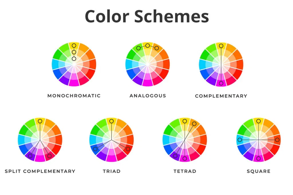 Let’s use blue-violet as an example.
2. Next, locate the coordinating color(s) on the color wheel for the color scheme you’d like. For example:
In a monochromatic color scheme, you will use the various shades of blue-violet beneath the main color on the color wheel.
In a complementary color scheme, yellow-orange, and its shades, tints, and tones will be the complementary colors you use with the blue-violet.
In a split-complementary color scheme, yellow-oranges, and red-oranges will be your coordinating colors.
An analogous color scheme (also called a related color scheme), green, blue-green, blue-violet, and violet will be among the colors you use to go with your blue.
3. From these basic coordinating color families, you can choose paint colors, fabrics, and all the necessary decor items for your space.
My favorite color wheel for decorating
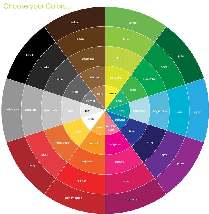
There are several color wheels out there.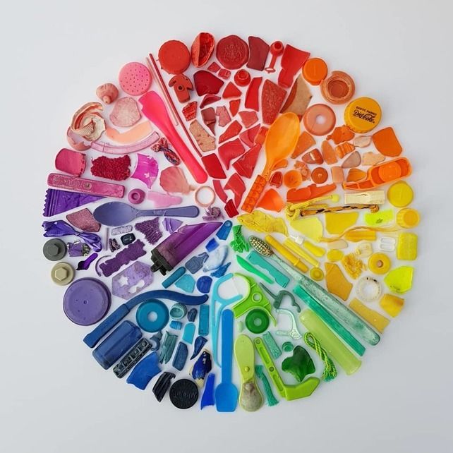 But my all-time favorite color wheel is this one, available on Amazon.
It’s meant specifically for interior design, so it includes colors that are more relevant to decorating than one meant for web or graphic design would.
It also has the color schemes summarized and a handy guide to colors that harmonize on it too.
If you’re unsure about the cost of getting a color wheel, keep in mind the potential cost of making color mistakes in your house – the paint, the fabrics, the furniture. If you’re decorating one or more spaces in your home, the return on your color wheel purchase could be huge!
Understanding Color Temperature (Undertones)
All colors – including white – are made up of other colors. Those other colors create something called an undertone. So, what are undertones?
Wait, maybe you’re thinking “I love and decorate with neutrals. I don’t need color theory.” Well, that would be wrong, my friend.
Even if you love to decorate with neutrals, you are actually decorating with color because every shade of neutral other than pure white and pure black is a color and has a color undertone. This is especially true with paint.
There are two types of undertones, warm undertones, and cool undertones.
In general:
- Warm colors with undertones like red and yellow feel cozy.
- Cool colors with undertones like blue and green feel calming.
Undertones matter in your home decor because they affect how your eyes see the colors you use.
3 ways to determine the undertone of a color
1. Use a color wheel
One simple trick to finding the undertone of something is to hold up your color wheel to it and see what color it most looks like.
2. Check the bottom of the paint swatch
THE EASIEST WAY TO FIND THE UNDERTONE OF A PAINT COLOR IS TO LOOK AT THE BOTTOM OF THE PAINT CHIP/COLOR SWATCH. This is especially true for white and neutral paint colors. If the bottom color has green in it, the white will too. If it is a pink color the white will have pink in it too. In this way, you can choose a white or neutral with warm or cool undertones that work in your space!
3. Grab a piece of printer paper
Another way to determine the undertone of a color – especially a white – is to hold it up to a plain piece of white printer paper. The white printer paper will provide contrast and you should be able to see the color as it truly is.
Undertones matter especially in decorating with neutrals as you’ll want to decide whether you have:
- Cool neutrals (with green, blue, or violet undertones) or
- Warm neutrals (with red, orange, or yellow undertones)
3 Tips for Choosing Your Home Color Palette
Remember a color scheme is a general framework used to put your colors together.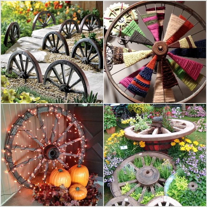 It’s based on the color wheel and color theory. While a color palette is the specific colors you choose for your home. It includes things like the names of your paint colors and specific fabrics, etc.
01| Ask yourself 4 questions before you choose colors
You should ask yourself 4 questions when you’re choosing a whole home color palette:
1. How do you want your home to feel?
Because colors evoke feelings, you will want to choose colors that evoke the feelings you want in your home. Do you want your home to feel relaxed and cozy or invigorating and energizing?
Warm colors like reds, oranges, and yellows will make your home feel cozy and lively. Cool colors like blues, greens, and purples are chill and relaxed.
Decide how you want your home to feel overall and choose colors that will help create those feelings.
2. What colors do you love?
Choosing a color that you love, will help ensure you won’t get sick of it any time soon.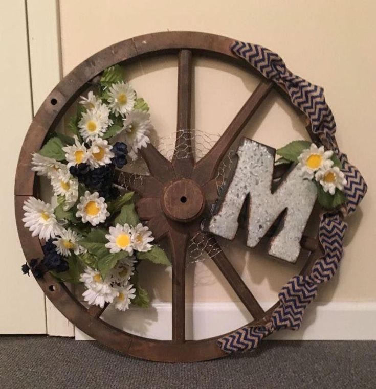 Granted if you love big bold colors, you may not want to go and paint every single wall in that color. But your favorite colors – in clothing, home decor, cars, etc. – can be a great jumping-off point for your whole home color scheme.
My favorite color happens to be black. Just one look at my everyday wardrobe and my favorite T-shirt that reads “black is my happy color” will tell you that.
Do you have a favorite color? Perhaps a glance at your wardrobe will help you determine what colors you are naturally drawn to?
By starting with a color that you love, it is unlikely that you’ll get tired of your color scheme quickly.
3. What colors are you stuck with?
Undoubtedly, you will have some things in your home that have to stay. Whether due to budget, time, or talent, you will need to take stock of these unchangeable elements in your home. Some of these things may be flooring, kitchen and bathroom cabinets, countertops, faucets, wall tiles, etc.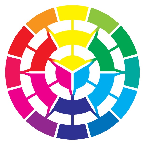
Unless you’re planning on renovating these as you decorate, they are fixed and—like it or not—play into the color palette you will choose for your decorating.
Most of us can’t change or renovate everything all at once. Some things have to remain long-term in your home.
Take cues as to colors you have to implement based on the unchangeable things in your home, like floors or cabinets that you’re not replacing for a while (or ever).
Pay attention to those fixed things and their undertones:
- What is the undertone of your home’s woodwork?
- What is the undertone of your home’s metal finishes?
4. Do you want a high-contrast color scheme or something a little more soothing?
Take a look at the four most common color schemes above again, paying particular attention to their descriptions.
If you love high contrast color, you may want to utilize a complementary color scheme.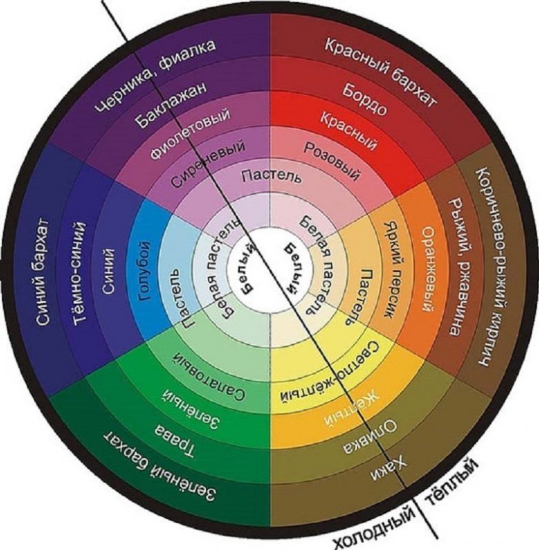
But if you want more of a soothing space without jarring pops of color, stick with a monochromatic color scheme (particularly one with plenty of neutrals).
02| Keep the 60-30-10 color rule in mind
The 60-30-10 rule is a basic and timeless color in interior design rule that states that 60% of the room should be a dominant color, 30% should be a secondary color (or pattern/texture) and 10% should be an accent. It’s a rule that when followed brings balance to the colors used in a space.
- 60% is the Main Color. The easiest way to incorporate your main color into over half of your space is to use your main color on the walls. If your main color is a bright color, you may not want to do that though. But if you do, try to use plenty of neutral colors too, to keep the space from feeling overwhelming.
- 30% is an Additional Color. The purpose behind the additional color is to bring some life and interest to the space.
 It’s best to use this additional color on furniture, rugs, and curtains.
 - 10% is the Accent Color. Generally, the accent color will be the brightest or most intense color in a space. You can utilize this accent color on vases, throw pillows, candles, and various other accessories. The benefit of using your accent color on these things is that they can be changed with the seasons or when you get bored of a specific color.
Our living room is mainly black and beige. By keeping the bigger things neutral, we can change out the accents with the season.
Red Holiday accents.Burnt orange accents for fall.Green accents for summer.03| THE best hack for choosing colors that work perfectly together every time!
Want to know my biggest hack for choosing colors?
Pull all your colors from an inspiration piece.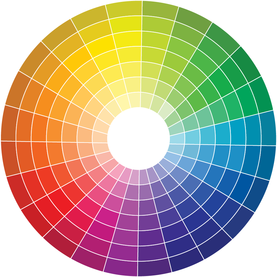
Your inspiration piece can be a multi-colored couch or a bedspread, a piece of art, or even a swatch of fabric you LOVE. Professional designers have already spent the time to put the colors together to create these things, so take advantage of that and pull your individual colors from a great piece!
Just be sure your inspiration piece works with the fixed or unchangeable items in your home such as flooring and countertops, etc!
Choose the Individual Colors for Your Whole Home Color Palette
The key to creating a great home color palette for your house is to use a limited number of colors – and to use them in different ways in each space. This will give you that cohesive flow you want, without every room looking identical.
Keeping in mind the color scheme you want to use, how your want your home to feel, and which undertones are already in your house, choose the following for your home color palette:
- A white
- A neutral
- One main color
- A second color
- A third color
For more help with your home paint palette, check out our course, Decorating Uncomplicated, which includes 8 done-for-you home color palettes!
10 No-Commitment Ways to Add Color to Your Home
Look at photos of any of the rooms in our home and you’ll see that I’m a ‘neutrals girl’ through and through. You see, I’m afraid of committing to any one single color because I know myself well enough to know that I tire of color very quickly. And it can seem very jarring to me to have bursts of color around the room.
For those reasons, I prefer to decorate with neutral colors. I paint walls in neutrals because while a wall can be painted over, such as when one accidentally chooses the wrong color, it can mean a lot of extra work. I prefer to choose neutral-colored furniture too so there’s a neutral base to work with when I want to change things up, as I inevitably do.
But that doesn’t mean I NEVER want color in my space. Personally, I crave a little more color in the late winter when everything is incredibly blah outside or in the heat of summer when refreshment is needed.
So how does one add color in interior design without committing to any one or two colors for the long haul?
By using a handful of these 10 no-commitment ways to add color to your decor, of course!
1.
 Add flowers
Cut flowers not only add some life and organic shapes to your room, but they can also add a splash of color whenever the mood strikes. Grocery store blooms are very inexpensive for those with a small budget. But kudos to you if you find and make friends with the local florist who will create a bouquet from in-season blooms to suit any budget! Or you could even go faux, and make your own reusable arrangement!
2. Trust the faithful throw pillow
Throw pillows come in all shapes and sizes and can generally be found rather economically if you’re willing to look. I like to buy the Ikea feather throw pillow inserts and then just swap out the covers with ones from Etsy or Society6 when the mood strikes.
DIY bunting or store-bought banners not only add a splash of color, but they can also make your home feel more festive, cheerful, and whimsical too. This is perfect if those are some of the desired feelings you want your home to convey!
4. Fill your home with plants
If you’re are far more talented than I and have a green thumb instead of a black one, plants can add color and cleaner air to your home too.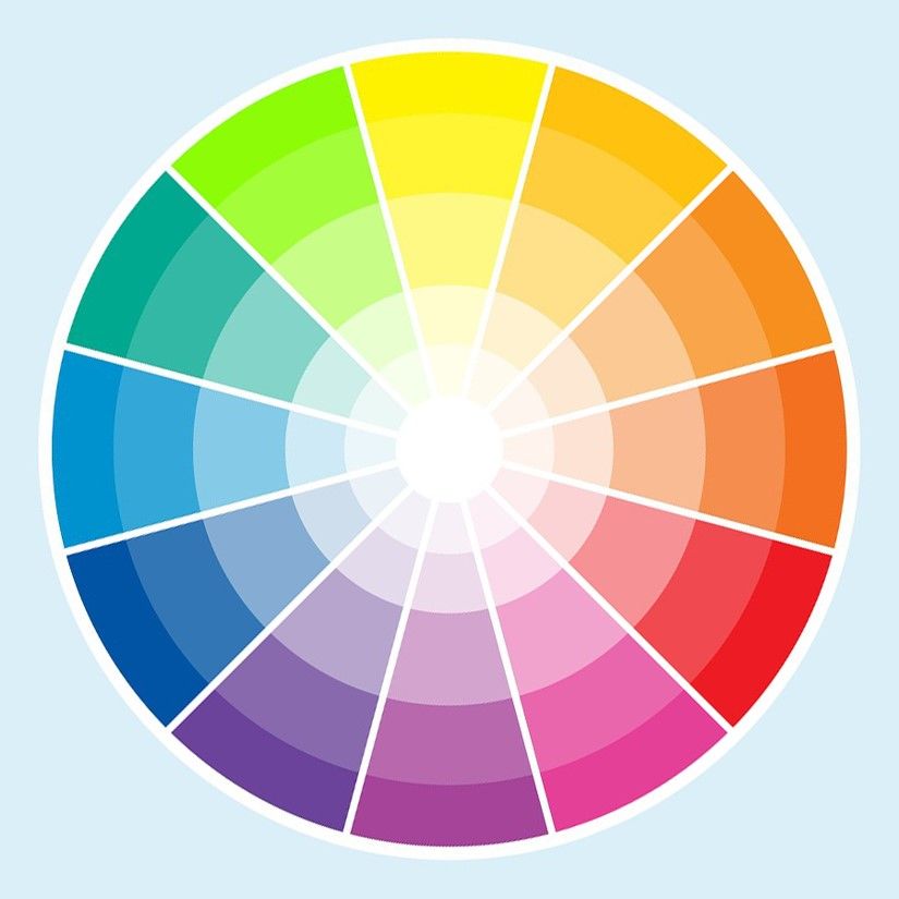
5. Add colorful art
There are so many places you can find downloadable and printable art these days – including our own Etsy shop – that it’s easy to swap out prints in frames whenever you feel like adding a splash of color – or even a different saying – to your walls or surfaces, without painting. You can even get large-scale art on a budget!
6. Display your books
There’s been quite the trend lately of either wrapping books in plain paper or turning them backward, spine in, to help them blend in better. Plus, you can use pretty reference or fiction books as decor as well. If you’re looking to up some color and you own those books anyway, you might as well put them on display.
7. Add wallpaper – of the removable type!
If you’ve got a little more time on your hands, and don’t mind the work, removable wallpaper may just be the ticket to a more colorful space without the scary commitment of a permanent wallpaper. Try applying it to just a single wall to draw attention to it, or apply it to a thin MDF panel, mounting it to the wall and completing it with a bit of trim.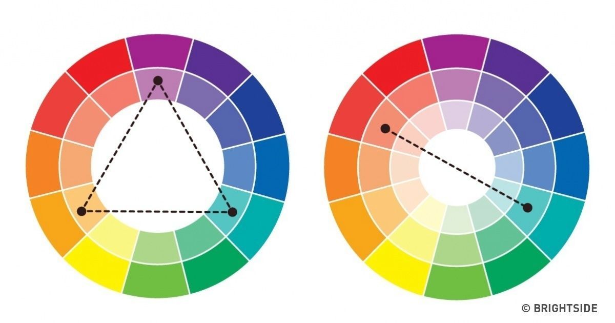
8. Cozy up with throw blankets
The companion of throw pillows, throw blankets can be heavy or light depending on the season and are even easier to switch out than other colorful accents. Bonus – they fold up pretty compact for storage.
9. Switch out a rug
I know, area rugs can sometimes be expensive. But they don’t have to be – especially given that they endure a lot of abuse underfoot. Rugs USA and Wayfair both have plenty of inexpensive area rugs that can pack a punch of color, or blend in with their neutral surroundings.
10. Change the curtains
If you’re craving a more colorful space, you can always hang colorful curtains. For a pop of inexpensive color, use curtain ring clips and hang anything from flat sheets to scarves to painted drop cloths.
So as you can see, if you’re a neutral lover like me, or if you’re just on a budget, you can add, take away and swap out whatever colors you like easily with these 10 no-commitment ways to add color to your decor!
If you’d like to study color in interior design further, or just look at how others are using color in their homes, you might like these books:
- The Colour Scheme Bible: Inspirational Palettes for Designing Home Interiors, Anna Starmer
- Habitat: The Field Guide to Decorating, Lauren Liess
- Colour: The Professional’s Guide: Understanding and Mastering Colour in Art, Design, and Culture, Karen Triedman
Do you have a good grasp of using color in interior design? Have you chosen a home color palette for your house? Do you know how to use a color wheel?
How to use a colour wheel for interior design and colour scheming
When you purchase through links on our site, we may earn an affiliate commission.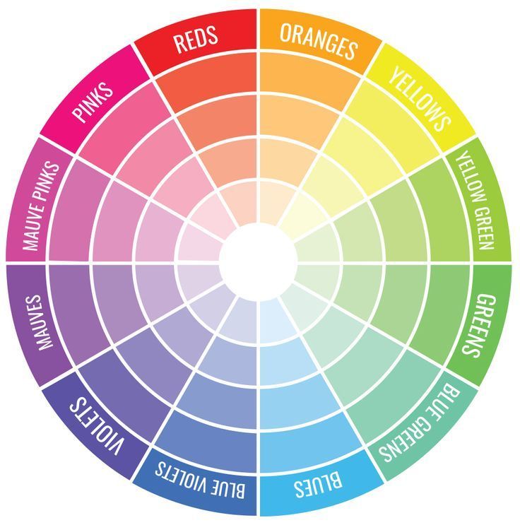 Here’s how it works.
(Image credit: Farrow and Ball)
Join our newsletter
Thank you for signing up to Realhomes. You will receive a verification email shortly.
There was a problem. Please refresh the page and try again.
By submitting your information you agree to the Terms & Conditions and Privacy Policy and are aged 16 or over.For what feels like an age, decorating with neutral colours has been the failsafe option. And while we love a clean, light colour scheme as much as the next person, we're increasingly tempted by the use of on-trend colours.
But how to work out which colour works well with which? And what is a colour wheel anyway? We asked Joa Studholme of Farrow & Ball for tips on how to use a colour wheel for interior design and scheming and she didn't disappoint.
So if you are tired of decorating with these various hues of greige, and want to introduce some brighter colours into your interiors check out this expert guide.
For more design advice and inspiration, check out our hub. Or, if you're focusing on incorporating colour into a specific room, you might want to take a look at our feature on choosing the right paint colour for every room.
1. Learn to utilise the colour wheel
The wheel that we are most used to seeing today has 12 sections and includes tertiary colours, which are combinations of primary and secondary colours: yellow-green, red-orange and so on. This wheel can certainly help you to understand how colours relate to each other – those that work together and those that don’t.
2. Choose a harmonious or contrasting colour scheme
Colours that sit side by side are known as analogous, and are broadly harmonious when used together, resulting in natural-looking, tranquil spaces. You might think it would be easy to work with a scheme of harmonious colours, but careful consideration is required to avoid creating a room totally lacking in vitality when the contrasts are so subtle.
Kitchen painted in Farrow and Ball Stiffkey Blue
(Image credit: Farrow and Ball)
Complementary colours are any two that sit directly opposite each other on the wheel, such as red and green. Using these creates schemes with maximum contrast, resulting in dynamic and exciting rooms with a more primal intensity. A colour scheme of complementary opposites also needs to be carefully considered to achieve a pleasing balance. When strong colours are included among them, it is often best to offset them with neutrals.
(Image credit: Farrow & Ball)
Your starting point may well be deciding whether you prefer a harmonious or a complementary scheme, and in this case the rules of the wheel can certainly be an aid in your colour selection. However, use it with caution: the infinite combinations and the relationship between colours are oversimplified in the wheel, and there is so much more to creating a successful decorative scheme.
Our colour blocking paint ideas provide plenty of inspiration, whether you're going for a harmonious or contrasting colour scheme.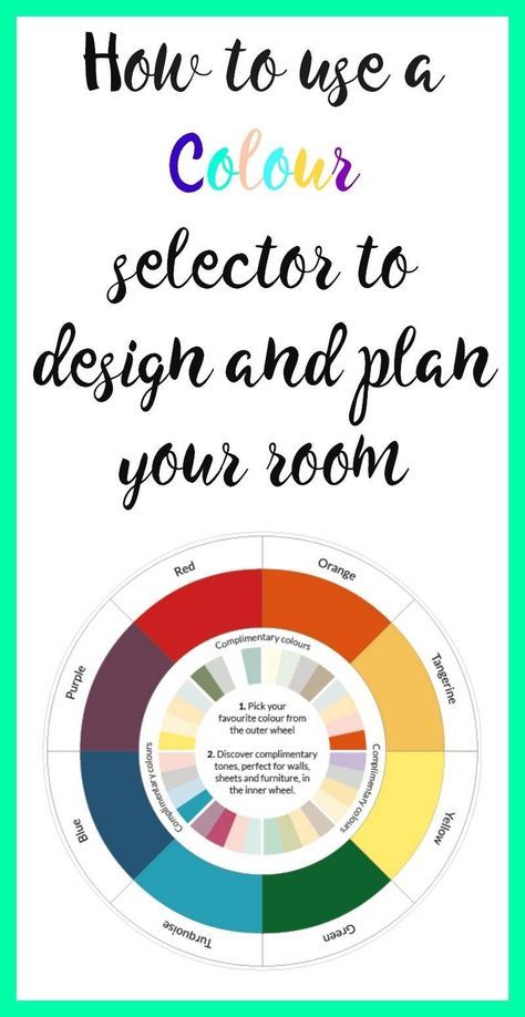
3. Consider the light
Natural lighting will have a significant effect on how a colour will look in a room, and your shade could end up looking vastly different to how it appeared in the shop. For this reason, it is best to view your paint outdoors and always take home a tester pot to view it in your planned room.
It is not just the amount of light you need to think about, but also the direction of natural light. For example, northern light has a cooling effect on most colours, so if you are working with a north-facing living room, cream and neutral shades are better than pure white to avoid a cold, clinical look. Again, any mid-darker hues will help to warm an otherwise cool room.
Bedroom painted in Farrow and Ball Blue Ground
(Image credit: Farrow and Ball)
4. Choose the best colour for your rooms
Use our advice below to choose the right shade of your preferred colour.
How to decorate with reds
Adored around the world, from the Victorian era to the present day, red is always warm and welcoming.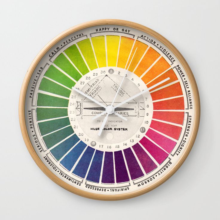 It is also the most powerful of colours. Painting a room in red is not, however, for the faint-hearted.
(Image credit: Farrow & Ball)
Strong reds are very well suited to dining rooms because they add drama and weight – they have a robust intensity and produce stimulating, powerful rooms that grab your attention.
In contrast, a less vivid red will create a more restful atmosphere, as the effect of the colour strengthens over a larger area.
More muted tones, such as Farrow & Ball’s Book Room Red , create warm rooms that are less challenging but still give a rich background, immediately evoking classical antiquity.
Living room painted in Farrow and Ball's Book Room Red
(Image credit: Farrow and Ball)
While red is sensual, pink has a gentler feel and its effect is more soothing. Although it is often viewed exclusively as a colour for girls, the great 20th-century colourist John Fowler used pinks like Setting Plaster or Pink Ground extensively, creating spaces that were soft but still full of impact.
Farrow and Ball's Pink Ground
(Image credit: Farrow and Ball)
How to decorate with yellows
Yellow has been enduringly popular since the 18th century, but it was only in the 20th century, when the influential interior designer Nancy Lancaster used the colour extensively, that it really entered the mainstream.
It is still a mainstay of decoration in everywhere from farmhouse kitchens to contemporary living rooms, never failing to create a lively atmosphere in a room.
Kitchen walls and dresser painted in Farrow and Ball India Yellow
(Image credit: Farrow and Ball)
Yellow enhances large spaces beautifully and also creates glorious rooms that are full of energy, whether with muted sophisticated tones, such as Hay , or the more vibrant, clean yellows.
Rich yellows like these can be perceived as sunshine, particularly in hallways, so they are always welcoming and often have the added bonus of making areas appear larger.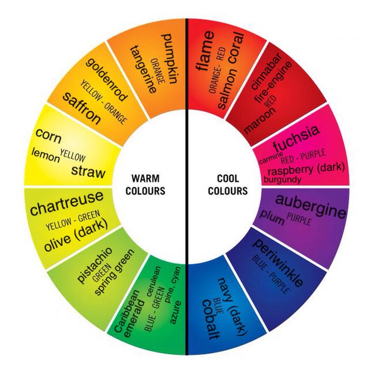
Top tip: Strong yellows are often best combined with a significant proportion of white to stop them being overwhelming.
Kitchen painted in Farrow and Ball Hay
(Image credit: Farrow and Ball)
How to decorate with greens
If you have a taste for the comfortable style of the English country house, tranquil and muted greens create rooms that are flexible and restful, as well as being the perfect backdrop to shabby-chic furniture and well-loved fabrics. They are best used with a traditional white, such as Off-White , to soften the contrast between walls and woodwork.
Room painted in Farrow and Ball Yeabridge Green
(Image credit: Farrow and Ball)
For a more upbeat room, you need to opt for a more vital green, like Arsenic . These colours often feature in kitchens because their refreshing, outdoorsy feel gives a room breathing space and creates a happy atmosphere.
Small bathroom painted in Farrow & Ball Arsenic
(Image credit: Farrow and Ball)
How to decorate with blues
The price of blue pigment once exceeded that of gold, but now the colour is more widely used in decoration than any other.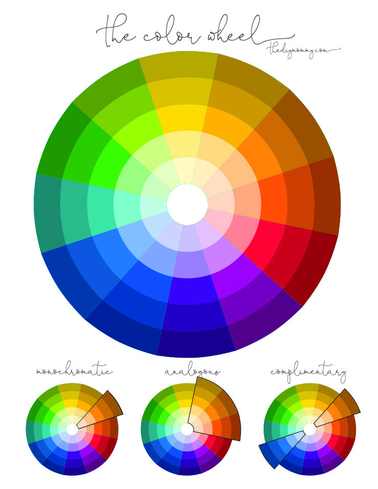 It reflects the soothing tones of both the sea and the sky, creating rooms with a timeless appeal.
Aqua blues, with their underlying green, produce pretty spaces that could never be seen as cold, making them perfect colours for bedrooms and bathrooms.
Hallway painted in Farrow and Ball Lulworth Blue and Wimborne White
(Image credit: Farrow and Ball)
The most relaxed and easy-to-use blues are those that lean towards grey. These shades work together seamlessly in any combination.
The darker, more sophisticated blues, which create a really dramatic, glamorous feel, have increased in popularity as an alternative to charcoal grey.
How to decorate with dark colours
Over the past decade it seems that many designers have crossed over to the dark side for their paint colours. People are less concerned about space and more concerned with mood, with the result that deep, saturated colours abound.
Although such shades are possibly not the first you would gravitate to, they can be an inspired solution in dark spaces, blurring boundaries so you can’t read the perimeters of the room.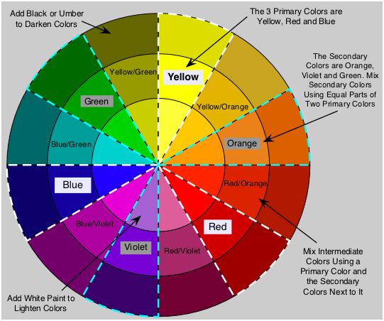
Bedroom painted in Farrow and Ball Railings
(Image credit: Farrow and Ball)
However, even in larger, open spaces, dark tones can flatter a room’s proportions; a very large-scale room may command a strong colour, such as Tanner’s Brown . Rooms painted in such seemingly simple colours evoke a complex response. They are undeniably moody, but have an unexpected hint of modernity about them, especially when only one colour is used on all the elements in the room.
Deep, rich shades, such as Pelt , serve as the perfect background for home furnishings, and their warm undertone gives them a softness, making them soothing and romantic in bedrooms.
From the muted grey tone of Down Pipe to the complex black-blue of Railings , darks are respectful of traditional proportions but can also create modern and dynamic spaces in the contemporary home.
If you are inspired to embrace the dark side, check out more of these dark and atmospheric decorating ideas.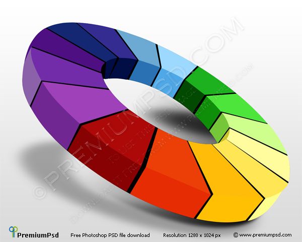
This is an edited extract from Farrow & Ball: How to Decorate by Joa Studholme and Charlotte Cosby, published by Mitchell Beazley, £30 from Octopus Books .
Looking for more decorating advice?
- 14 grey wallpaper ideas
- 8 Mid-century decorating ideas
- 17 creative colourful kitchen ideas
How to combine colors in the interior: using the color wheel and other techniques
Use the color wheel
1. For a monochrome space
If you want to bring a monochrome interior to your home, you don't have to choose strictly one tone and stick to it. In this case, it will take a very long time to collect materials and furniture, and the result can turn out to be flat and boring.
Wikimedia Commons
nine0006 Look at the color wheel and choose the shade you want to be the main one. Now pay attention to the beam of flowers coming from the center it hit. You can use all these shades in your interior to create a monochrome.
 If you have chosen a light muted tone as the main color, then for point accents you can choose dark saturated tones from the same range, and vice versa.
Unsplash
Instagram: @homeinhoneyfields
Instagram: @_shallash
Instagram: @asma__omer
2. For a two-tone space
If you are planning to create a bright and contrasting interior, you will need two different colors that overlap well. If you already have one favorite color and you are pairing it, first find it on the color wheel.
Wikimedia Commons
For example, you like the reddish orange in the middle of the hue stripe. Calculate where it is from the center. Now draw a straight line from it through the center, as if dividing the whole circle in half. You will be taken to blue-green tones. Count the same number of steps from the center as the orange, and you'll find the perfect match for it.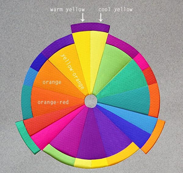 nine0029
Such contrasting combinations of bright colors are best used in non-residential rooms: in the kitchen, in the bathroom, in the hallway. For a bedroom or living room, choose colors closer to the center or edge of the circle, they are softer and lighter.
Instagram: @retrostylebylinda
Instagram: @houseonmerrittstreet
3. For tricolor space
The 60/30/10 rule can also be used to select colors. This means that you choose the main color, which will take up a little more than half of the entire space, add one large contrasting shade and one spot to it.
Wikimedia Commons
Using the color wheel, you can choose these colors like this: find the main shade that you like, and pick the remaining two at the same distance from the center, but to the right and left of it. That is, three successive horizontal shades. nine0029
For example, you took lemon yellow as a base. Next to it are orange and lime tones. It will turn out not flashy, calm solution.
Instagram: @tomfaulknerfurniture
Instagram: @nataliamprojekty
If the previous method seems boring, you can use the color wheel to match the three colors differently. nine0007
Wikimedia Commons
Find the shade that you have already chosen as a base. Next, mentally create an equilateral triangle with one of the vertices in the selected section of the circle. For example, you settled on orange. At the same distance from it will be red and blue shades.
In general, it is not necessary to stick to an equilateral triangle. You can easily move two vertices one step down or up, right or left. nine0007
Instagram: @cocciolatte
Instagram: @hus_nr_28
4. For a four-color space
The most complex scheme in terms of materials, decor and furniture that you can use, since finding the right amount of matching objects and surfaces is not easy . This scheme can be useful for large rooms or complex multi-color styles, such as pop art or boho. nine0007
Wikimedia Commons
But finding matching shades on the color wheel in this case is very easy. Just write a square or rectangle in it.
Geometric figure vertices will always indicate good combinations.
Instagram: @sivan.konvalina
Instagram: @jennshomestyle
Instagram: @annlacouture6
Pay attention to the paintings and photos
It is not necessary to look for beautiful color combinations on your own. Artists and photographers have already done this for you. Here is what you can do.
- Take your favorite painting or canvas in digital form and upload it to a website that matches the pixel tones. So, by clicking on the picture, you will find out exactly what colors are combined in the image you have chosen and select the paint or fabric of the same tone. Look for websites that suggest Pantone colors to make it easier to navigate the store. nine0087
- Upload an image to a site that collages the main colors used. This technique is more convenient if the image is complex and consists of dozens of different colors. The program will select some of the most frequently used options.
In both situations, you can also use Pantone Studio or Adobe Capture.nine0006 Unsplash
Instagram: @manders_kraski
Get inspired by nature
You can start from the color combinations that surround you in nature, everything is harmonious in it. Try picking colors that go with your favorite season. Cold bright and light shades are suitable for spring: light green, pink, blue, lilac, lemon. For summer - warm and saturated: green with a hint of yellow, red, brown, orange. For autumn - warm and in yellow-orange colors. For winter - a combination of white with blue or gray. nine0007
Instagram: @likemyhome
Instagram: @gooddom43
Instagram: @loft.ds
Instagram: @prorooms and yellow is a shade of intellectual activity. The psychology of color is much deeper and more interesting. Try to pass the Luscher color test on your own or with the help of a familiar psychologist. Its result will offer you four shades that you will associate with self-esteem, self-trust, development, and limitations. In this case, the shades will lie in the standard range: red, green, blue and yellow. nine0007
Instagram: @dariadesigner_interior
Instagram: @dondecor_life
Prepared by
Maria Revina
Itten's color wheel.
 5 ways to combine colors correctly
 I want to share some interesting, in my opinion, and useful information.
Some of you may have already heard about Itten's Color Wheel, which offers us 5 ways to learn how to combine the craziest colors without making mistakes. nine0007
Itten Johannes is a Swiss artist, theorist of new art and an outstanding teacher. He gained worldwide fame thanks to the Bauhaus curriculum he formed, the so-called forkurs, which formed the basis for the teaching of many modern elementary art schools.
Thoughtful researcher, Itten outlined his theoretical and pedagogical views and, what is especially valuable, the very system of training artists in his famous books on color and form, published in many languages. nine0007
His system is designed not to suppress the personality, but to help the artist choose his own path without losing confidence in his abilities.
Its elementary table will wean you from being afraid of multi-colored things and will help you combine them harmoniously.
Method 1: Combination of primary colors
There are three primary colors:
- blue;
- red;
- yellow.
They are located in the central triangle, for easier perception they are interconnected. These three colors look amazingly harmonious in one image, both all together and in combination in pairs. nine0007
The combination of these three primary colors is strong, vibrant and emotional. It lacks the contrast of additional shades. And expressiveness is achieved by the difference in shades.
Choose one of these basic colors and buy, for example, a red turtleneck, and to it - a yellow skirt and a blue slip dress (see photo 1) or choose the main color and accessorize from this "color triplets."
Everything! The image is ready! :)
Method #2: Analog Color Combination
This is one of the easiest ways to combine colors in clothes.
Analog colors stand side by side in a circle and in sequence.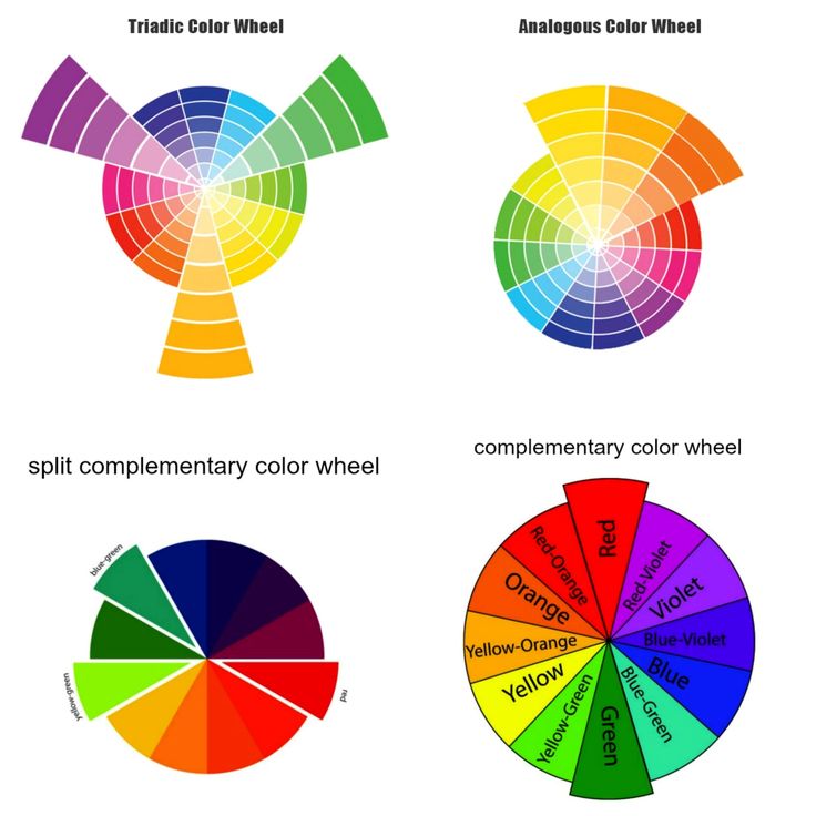 You choose one of them, for example, green - and boldly combine it with things of analog colors standing in a circle in the neighborhood, in addition, sky blue and turquoise will perfectly fit into such an image. As an example - the image of the girl in the picture on the left (see above): a turquoise sheepskin coat, a sea-green combination dress and a blue handbag - unusual, stylish and very elegant! nine0007
Or in the photo below. Purple is said to be the color of depression and loneliness. Perhaps somewhere this is true, if these are repetitive monotonous images from day to day, but when you dilute one purple with related tones and halftones, add fuchsia next to it, then spring, flowers, birdsong and a great mood are immediately on your face! :)
Analog colors always look very harmonious, calm and
disposing and between them there is no bright contrast.
Method #3: Opposite Color Combinations
Opposite colors are used for this combination method.
As an example, consider a pair of blue-orange or purple-orange, which, it would seem, is perceived critically by ear). For example, a dark blue (blue-black) hoodie gives an image of rigor and elegance, and a silk orange skirt in linen style - brightness and romance - looks luxurious! nine0007
To experiment, choose any shade on the palette and, in order not to get confused, connect it with the opposite one with a line.
Method No. 4: Combination of colors according to the triangle principle
This method is also called the classic triad.
(By the way, there is another method based on the principle of a square or a quadrilateral, where more colors are obtained in the image, but this is for more daring girls who are prone to creative experiments).
For the “triangle” method, it is enough to choose one base color for the image on the circle and combine two more with it in such a way that a triangle is obtained. nine0007
Let's say we chose bright blue (electric) and build a triangle - two of its vertices will be yellow and one of the red tones.