Best designed rooms
31 Living Room Ideas from the Homes of Top Designers
Decorating
Find inspiration in the stylish living spaces of the world’s top talents
By Alyssa Wolfe
The world’s famed designers create exquisite interiors for their clients, but what about the spaces they fashion for themselves? For these sought-after professionals, their own homes are places to express their personal tastes and experiment with new trends, showcase bold patterns, and display treasured art and antiques. We’ve gathered a selection of the elegant and inspiring living rooms of decorators and architects whose residences have appeared in the pages of AD, each filled with smart and stylish ideas for your own design project. From over-the-top grandeur to sleek modernism, see the stunning spaces where the world’s top talents entertain and relax.
Photo: Pieter Estersohn
Architect Lee Ledbetter renovated a landmark 1963 house in New Orleans to share with his partner, Douglas Meffert. Surrounding the custom-made cocktail table in the living room are a pair of Harvey Probber brass armchairs upholstered in a KnollTextiles fabric, two Louis XVI–style fauteuils in a Holly Hunt leather, a vintage T. H. Robsjohn-Gibbings chair in a Zoffany stripe, and a vintage Florence Knoll sofa in a KnollTextiles Ultrasuede. A large mixed-media artwork by Robert Helmer hangs on the brick wall, which is painted in Benjamin Moore’s Decorator’s White.
Photo: François Dischinger
Designer Sara Story restored a Victorian home in Snedens Landing, New York. An artwork by Sterling Ruby and a zebrahide add pizzazz to the living room.
Photo: Douglas Friedman
With the help of architect Eric Ryder, designer Brigette Romanek renovated a historic Laurel Canyon home for her family. The living room is outfitted with a pair of Marco Zanuso lounge chairs from Eccola, a Blackman Cruz console (left), and a Hans Wegner chaise longue.
Photo: Ricardo Labougle
A large Roberto Matta canvas overlooks the living room in Linda Pinto’s Paris apartment. In the foreground at left is a bronze side table by Claude Lalanne, next to a sofa accented with 1970s fur pillows; the cocktail tables are by Ado Chale, the sculpture in the far right corner is by Philippe Hiquily, and the rug was custom made by Tai Ping.
Thomas Ruff’s photograph Substrat 24 I dominates the living room of Jamie Drake’s Manhattan apartment. Arranged around a marble-and-granite table by Drake Design Assoc. are a Milo Baughman lounge chair in a Christopher Hyland mohair, a Drake-designed sofa in a Schumacher fabric, and a pair of club chairs and a Bright Group ottoman that are covered in Rubelli velvets from Donghia. The curtains are of a Clarence House fabric, and the walls are painted in Benjamin Moore’s Sidewalk Gray, with a Venetian-plaster finish by the Alpha Workshops. The carpet is by the Alpha Workshops for Edward Fields.

Photo: Richard Powers
What appears to be a gilt-framed mirror in Timothy Corrigan’s Paris apartment is actually a window aligned with two mirrors, one in the living room and one in the dining room beyond. Corrigan highlighted the ingenious hall-of-mirrors illusion by installing matching Napoléon III chandeliers in the two rooms. The armchairs and the curtain and sofa fabrics are all from Schumacher’s Timothy Corrigan Collection; the stools are vintage Jansen, and the carpet is a Corrigan design for Patterson Flynn Martin.
Photo: Miguel Flores-Vianna
The heart of the Allegra Hicks’s Naples, Italy, apartment is a long, high-ceilinged room divided into living and dining areas, each anchored by carpets designed by Hicks. The designer also created the Roman-shade fabric, the cut velvet on the wood-framed Jindrich Halabala armchairs, and the butterfly-specimen table at right; an 18th-century Venetian mirror surmounts the mantel.
Most Popular
Photo: Roger Davies
dam-images-decor-2013-03-designers-living-rooms-designers-living-rooms-27.
 jpg
jpgArchitect Jorge Elias filled his 17,000-square-foot home in the Jardim Europa neighborhood of São Paulo with extraordinary antiques and images. An 18th-century Russian chandelier, vintage velvet sofas, Louis XV fauteuils, a gold-leafed Hand chair by Pedro Friedeberg, and artworks by Serge Poliakoff and Fernand Léger are among the eclectic mix in the living room.
Related: See More Home Remodeling & Renovation ideas
Photo: Douglas Friedman
The former Manhattan living room of designers Nate Berkus and Jeremiah Brent features circa-1970 Georges Pelletier ceramic lights above a vintage sofa by Afra and Tobia Scarpa for Cassina, a ’70s Jansen brass cocktail table, and a French steel low table; the vide-poche table in the foreground is a ’50s design by Jacques Adnet, and the windows are dressed with curtains and rods by RH and tassels found at a market in Thailand.
Photo: Björn Wallander
In Pedro Espírito Santo’s frescoed Lisbon, Portugal, salon, an 1860s Orientalist painting is flanked by foil bouquets.
 The gilt-wood fauteuil is antique, the cocktail table is Asian, and the needlepoint carpet was custom made.
Most Popular
Photo: Oberto Gili
Surrounding a living room doorway in the Hamptons home of David Kleinberg are two Richard Serra prints, one displayed over a mahogany cabinet by Paul László; the photograph in the hall is by Alejandra Laviada. Twin French Art Deco zebrawood side tables are joined by Art Deco armchairs covered in a Rogers & Goffigon fabric; the upholstery throughout the house was done by Anthony Lawrence-Belfair, the throw is from Homenature, and the raffia rug is by La Manufacture Cogolin.
Photo: Pieter Estersohn
An artwork by Terry Winters overlooks the Nashville, Tennessee, living room of interior designer Ray Booth and television executive John Shea. Roust, one of their two Siamese cats, strikes a noble pose next to a Minotti chaise longue. A Christophe Delcourt floor lamp and a Robert Lighton side table flank the sofa, also by Minotti; the carpet is by Stephanie Odegard Collection.
Photo: Pieter Estersohn
At the Montauk, New York, home of designers Vicente Wolf and Matthew Yee, framed photographs from Wolf’s collection—including images by Louise Dahl-Wolfe, Edward Steichen, and André Kertész—line the shelves above the living room’s sectional sofa, which is upholstered in a Janus et Cie fabric.
Most Popular
Photo: Scott Frances
In Alexa Hampton’s New York living room, a detail of the Parthenon’s frieze, painted by Hampton, hangs above the custom-made sofa, which is covered in a Kravet fabric; the klismos chair is by Alexa Hampton for Hickory Chair, Louis XVI chairs flank the mantel (designed by Hampton for Chesney’s), and the Irish matting is by Crosby Street Studios.
Photo: Ricardo Labougle
Lorenzo Castillo accented the drawing room of his Spanish retreat with a wallpaper from his collection for Gastón y Daniela; the vintage cabinet-on-chest is by Pierre Lottier. The Castillo-designed armchair at left is clad in a Designers Guild velvet, 1970s patchworks hang above the suede sofa, and the vintage cocktail tables were found at Paris’s Marché Paul Bert.
Photo: Pieter Estersohn
In Holly Hunt’s Chicago apartment, a massive Helen Frankenthaler canvas faces a Louise Nevelson sculptural work across the living room. At center, a Holly Hunt Studio cocktail table topped with a John Chamberlain sculpture joins a Holly Hunt leather sofa cushioned in a Great Plains velvet and a pair of Paul Mathieu chairs upholstered in an Edelman leather; the floor lamps are by Christian Liaigre, the Tristan Auer ottomans are in a Kyle Bunting leather, and the rug is by Christian Astuguevieille. A custom-made Vladimir Kagan sectional sofa in a Great Plains wool nestles in the bay window.
Most Popular
Photo: Vincent Thibert
dam-images-decor-2013-03-designers-living-rooms-designers-living-rooms-01.jpg
AD100 designer Jacques Grange’s Paris apartment—once home to the novelist Colette—overlooks the gardens of the Palais Royal. The living room is furnished with a 19th-century chaise longue, club chairs from 1925, an 18th-century desk, and a Jean-Michel Frank armchair from 1930.
Photo: Ngoc Minh Ngo
dam-images-decor-2013-03-designers-living-rooms-designers-living-rooms-02.jpg
A sculptural staircase framed in polished chrome catches the eye in late AD100 interior designer Alberto Pinto’s lively Rio de Janeiro apartment, which was renovated by architect Thiago Bernardes. Pinto designed the sofa, the painting is by Nancy Graves, and the armless chairs are by William Haines.
Photo: Pieter Estersohn
dam-images-decor-2013-03-designers-living-rooms-designers-living-rooms-03.jpg
In AD100 interior designer Muriel Brandolini’s eclectic Manhattan townhouse, Antipodal Shopperby George Condo is displayed above a midcentury Italian sofa; the cocktail table is by Mattia Bonetti, the vintage light fixture is by Gerrit Rietveld, and the oval portrait is of Muriel’s husband, Count Nuno Brandolini, as a child.
Most Popular
Photo: Björn Wallander
dam-images-decor-2013-03-designers-living-rooms-designers-living-rooms-05.
 jpg
jpgAD100 decorator Michael S. Smith was inspired by 18th-century France when he decorated the elegant Manhattan duplex he shares with HBO executive James Costos. The walls display an Ellsworth Kelly lithograph and an antique overmantel mirror, while Louis XV–style canapés, a Jansen sofa, and Louis XVI–style gilt-wood fauteuils mingle with a Chinese low table and Japanese lacquer robe chests. The decorative woodwork is by Féau & Cie.
Photo: Tim Beddow
dam-images-decor-2013-03-designers-living-rooms-designers-living-rooms-06.jpg
Design team Paolo Moschino and Philip Vergeylen revamped a flat near London’s Victoria station, keeping only the original 19th-century cornices and the oak parquet floor. A pair of brass bookshelves inspired by a Billy Baldwin design for Cole Porter flank a work on paper by Jean Cocteau. The vintage console is by Jansen, and the sofa is by Moschino’s firm, Nicholas Haslam.
Photo: Roger Davies
dam-images-decor-2013-03-designers-living-rooms-designers-living-rooms-07.
 jpg
jpgAD100 designer David Easton and artist James Steinmeyer gave the living room of their modern Tulsa, Oklahoma, getaway a warm makeover with Venetian-plaster walls painted in a Pratt & Lambert gray and Louis XVI–style slipper chairs upholstered in a crimson silk velvet. The mantel is by Easton, and the armchairs and ottoman are from his line for Lee Jofa, as are the fabrics covering them.
Most Popular
Photo: Miguel Flores-Vianna
dam-images-decor-2013-03-designers-living-rooms-designers-living-rooms-11.jpg
The living room walls in antiques dealer and designer Richard Shapiro’s Malibu, California, retreat are sheathed in frescoed plaster, and a 17th-century Italian mirror hangs above an antique Cypriot mantel; Shapiro designed the chairs, the Patricia Roach floor lamp is from his furnishings company, Studiolo, and the wood stools are 19th-century Ghanaian.
Photo: Thomas Loof
dam-images-decor-2013-03-designers-living-rooms-designers-living-rooms-12.
 jpg
jpgInside a glass tower overlooking the Manhattan skyline, Todd Alexander Romano created a high-impact design for his 600-square-foot studio. Inspired by the bold color choices of legendary decorator Billy Baldwin, the designer lacquered the walls and upholstered the custom-made sofa in midnight-blue. Prints by Robert Goodnough and Josef Albers add a vibrant contrast.
Photo: William Waldron
dam-images-decor-2013-03-designers-living-rooms-designers-living-rooms-13.jpg
Alex Papachristidis decorated the Bridgehampton, New York, home he shares with his extended family using luxe fabrics and eclectic finds that provide the newly built home with a sense of history. Gilded 19th-century stools and custom-made sofas upholstered in a Clarence House fabric are mixed with animal print–covered armchairs and pillows.
Most Popular
Photo: Roger Davies
dam-images-decor-2013-03-designers-living-rooms-designers-living-rooms-16.jpg
At his modern Los Angeles getaway, AD100 architect and designer Daniel Romualdez introduced a fur rug, a reclaimed-wood cocktail table by André Joyau, and a pair of John Dickinson lamps to help soften the sleek white space.
 A painting by Sarah Morris hangs on the far wall, the print above the fireplace is by Christopher Bucklow, and the acrylic armchairs are by Paul Rudolph.
Photo: Pieter Estersohn
dam-images-decor-2013-03-designers-living-rooms-designers-living-rooms-18.jpg
In Atlanta, AD100 decorator Suzanne Kasler renovated her Regency-style house with the help of architectural designers William T. Baker & Assoc. She employed a soothing palette of cream, beige, and white for the living room. “I like colors with a gray undertone,” she said. The velvet sofa is from Kasler’s line for Hickory Chair, the acrylic tables and curtain fabric are by Nancy Corzine, and the rug is by Beauvais Carpets.
Photo: Pieter Estersohn
dam-images-decor-2013-03-designers-living-rooms-designers-living-rooms-19.jpg
A stainless-steel wall sculpture by Octavio Abúndez hangs in the living room of Nate Berkus’s former duplex in Manhattan’s Greenwich Village, and the Gilbert Poillerat chairs are upholstered in a Clarence House linen.
 Berkus furnished the apartment in the 19th-century building with pieces he had collected over the years, including many furnishings from his previous home in Chicago.
Most Popular
Photo: Eric Piasecki
dam-images-decor-2013-03-designers-living-rooms-designers-living-rooms-21.jpg
When AD100 interior designer David Kleinberg moved to an apartment on the Upper East Side of Manhattan, he chose to retain the home’s original 1920s architectural details as well as the ornate millwork installed by previous owners; he updated the latter with cream and white paint. The vintage light fixture is by Swiss architect Max Ernst Haefeli, and the painting is by Garth Weiser.
Photo: Roger Davies
dam-images-decor-2013-03-designers-living-rooms-designers-living-rooms-23.jpg
Brazilian architect and designer Sig Bergamin crafted a vibrant living room in the São Paulo home he shares with architect Murilo Lomas. Murano-glass vessels are displayed on either side of a Vik Muniz painting, and the sofas are covered in a Rubelli velvet.
Photo: Tim Beddow
dam-images-decor-2013-03-designers-living-rooms-designers-living-rooms-25.jpg
Russian architect Dmitry Velikovsky created a refined yet exotic look for his Moscow penthouse, whose living room features an antique gilt-wood sofa, a Senegalese armchair, and an 18th-century samurai chair; a painting by Viktor Pivovarov hangs above the fireplace, and a Picasso etching leans against the bookshelf.
Explore2013interiorsdecorad100April 2013Decoratingdesign ideas2016 Home Renovation Guide
Read More71 Best Living Room Decor Ideas 2022
Advertisement - Continue Reading Below
1
Refresh With Accent Paint
We're loving this dark blue-green color in a living room corner designed by Avery Cox. It's stylish enough to hold its own against the rich chartreuse velvet fabric as well as the layers of quirky prints. She only painted one of the walls along with the door and moldings so that a complementary wallpaper could be applied on the opposite side.
2
Put a Record On
Victoria Sass of Project Refuge Studio snuck a record player into the corner of this texture-rich and minimalist living room. It opens right up into the kitchen, where the side of the island facing the sitting area contains ample exposed shelving for an extensive record collection.
Victoria Sass3
Display Old Books
There's just something about old books that instantly makes a room feel more personal. Whether you collect used books or you've inherited some, display them on an exposed shelving unit so they can shine. In this living room designed by Oliver Thornton, they add character and speak to the layered warmth of the furnishings.
Oliver ThorntonAdvertisement - Continue Reading Below
4
Warm Up Walls With Wood
Designer Nicole Dohmen applied hardwood floors in a Hungarian point pattern in this living room. It's a complex and classic parquet flooring design that works surprisingly well with modern furniture and geometric patterns, as seen here. But the fun doesn't stop there! Dohmen also applied wood panels to the wall for an extra surge of warmth.
5
Balance Hard Materials With Soft Ones
If your living room has hardwood floors or stone tile flooring and lots of glass surfaces like this one designed by Caroline Turner, soften it up with super plush seating and rich materials like velvet in jewel tones. A statement light also helps bring down the scale of the high ceilings.
Caroline Turner6
Enhance a Bakyard View
Working with landscape architect Lila Fendrick, designer Nestor Santa Cruz chose a wall of steel and glass windows and doors for this formal pool house living room that leads to the backyard. Though the glass decor, from the pendant light to the coffee table and doors, leaves a decidedly sleek impression, the plush rug and ethereal curtains make it extra cozy, too.
Advertisement - Continue Reading Below
7
Dabble In Nostalgia
Embrace old-fashioned trends and hand-me-down furniture, like this chaise in a nostalgic yet contemporary living room designed by Amity Worrel. Dainty florals, ginghams, and plaids are paired with modern accents and artwork, so the classic prints take on a whole new meaning.
Andrea Calo8
Work Around Restrictions
When designer Celerie Kemble moved into this New York City apartment, there was only one thing that prevented it from being the perfect fit: The building had a no wallpaper rule. To work around that obstacle, she applied a light shade of pink paint in a plaster-like finish that channels the texture of wallpaper.
Karyn Millet9
Mix Clean Lines With Casual Materials
In the living room of designer Devin Kirk, a light shade of blue-gray along with clean-lined furniture makes for a polished backdrop while the woven chairs, light wood side table, and tree stump coffee table ensure a laidback atmosphere. It's the perfect balance of approachable and formal.
Advertisement - Continue Reading Below
10
Incorporate Fun Trees and Plants
Invite some nods to nature into your living room with quirky indoor plants and trees. Designer Elizabeth Cooper placed a lush citrus tree in the corner for an extra pop of life and color and then staggered topiaries on the windowsill.
Read McKendree11
Create Zones With Area Rugs
This sitting room is right off the open kitchen, so designer Regan Baker decided to visually separate it with a custom sectional and area rug. A cleek armchair is positioned at a diagonal, establishing a nice balanced whole.
Laure Joliet12
Add Personality With Texture-Rich Neutrals
A quirky indoor tree is s fun surprise in this polished and cosmopolitan living room designed by Shawn Henderson. And, instead of a classic white or warm off-white paint color, he opted for a cooler gray neutral that complements the other subtle tones throughout the room. This also allows the texture-rich accents to shine.
Advertisement - Continue Reading Below
13
Extend It Outdoors
This vacation home in Maui, Hawaii blends indoor and outdoor living beautifully. Designed by Breeze Giannasio Interiors, the two living spaces are connected by a sliding door that simply disappears when open for total connection between the open-air terrace and the indoor living room. The materials, colors, and fabrics are all coordinated for visual flow, too.
Stacy Zarin Goldberg14
Transform a Generic Space With Texture
If you live in a generic rental or simply have a small space, get inspired by this living room designed by David Frazier. Not only does it prove that size isn't everything, but it's also full of tricks that bring more dimension to otherwise simple architecture. Pops of marigold speak to the warm antique wood pieces and break up the monochromatic color scheme and the large rice paper pendant keeps things casual so it can function as a more relaxed family room. A gallery wall, large indoor plant, and ceiling-high curtain rod add depth.
Check out Society6 for affordable and stylish prints and artwork to jazz up your walls.
Gieves Anderson15
Get Weird On the Coffee Table
Instead of decorating your coffee table with the classic assortment of stacked coffee table books, opt for something subtly quirky and unique. Here, Romanek Design Studio covered the surface with a collection of classic pots and planters, which both enhance and juxtapose the formal, traditional elements throughout the space as well as the more modern ones, making for a fun and eclectic yet timeless sprawl.
Check out Terrain for all your indoor and outdoor gardening needs.
Romanek Design StudioAdvertisement - Continue Reading Below
16
Swap High Back Seating for Daybeds and Benches
Bring in extra seating with daybeds, settees, and window seats in smaller spaces. They have lower back profiles, which prevents interrupting the visual flow and also keeps the space feeling open. We're loving the pop of yellow in this bold living room by Courtney McLeod.
Check out Albany Park for great living room seating options.
Frank Frances Studio17
Redefine "Neutrals"
If you don't love playing with tons of patterns and bold hues but appreciate experimental pieces and tasteful pops of color, take notes on this living room. Rather than opting for all black and whites, the anchor pieces—like sofa and tables—remain neutral, while the throws, artwork and lamp offer just a splash of color (nothing too crazy: just marigold, red, navy, and green).
Check out Design Within Reach for iconic design pieces.
Nicole Franzen18
Carve Out a Home Bar
In this living room designed by Carmel Greer, the paint color (Peach Blossom by Benjamin Moore) and casual jute rug set a sweet foundation while the modern, angular artwork, right fixture, seating, and throw blanket bring an edge. One built-in niche is optimized to function as a full-on home bar station while the other stores and displays firewood. The mirrored wall within the left niche also helps bounce light and gives it a swanky nightclub vibe.
Check out Huckberry for great home barware.
Stacy Zarin GoldbergAdvertisement - Continue Reading Below
19
Add Something Unexpected
While the classic blue grasscloth wallpaper, floor lamp, and curtains set the stage for a traditional living room, designer Heather Hilliard added some unexpectedly edgy elements. The floral sofa and the green lucite coffee table are a welcome surprise that break up the classic elements without overshadowing them.
Check out Kartell for cool lucite furniture.
Heather Hilliard20
Conceal Your TV
This neutral-toned living room by Kristin Fine is refined and grown-up, but also family-friendly. The soft and textural upholstery mixed with cream paint, rustic wood pieces, and plenty of antique accents are partially to thank, but there's also a large television mounted to the wall for family movie marathons. Fine gave it prime over-the-mantel placement but discretely tucked behind panels that double as modern art.
Check out Samsung for clever tech television designs.
Nicole FranzenHadley Mendelsohn
Senior Editor
Hadley Mendelsohn is House Beautiful's senior design editor and the co-host and executive producer of the podcast Dark House. When she's not busy writing about interiors, you can find her scouring vintage stores, reading, researching ghost stories, or stumbling about because she probably lost her glasses again. Along with interior design, she writes about everything from travel to entertainment, beauty, social issues, relationships, fashion, food, and on very special occasions, witches, ghosts, and other Halloween haunts. Her work has also been published in MyDomaine, Who What Wear, Man Repeller, Matches Fashion, Byrdie, and more.
TOP 50 Best Hotel Website Designs in the World - Plerdy
It is unlikely that while traveling you will agree to live in a tent or in the open air, choosing a hotel is an integral part of almost any long trip. Since room reservations are most often made via the Internet, the importance of hotel website design is increasing. A potential client loves the product “with their eyes”, this must be taken into account when designing the site, you need to make sure that the visitor remembers it at first sight.
What should be the design of the hotel website?
 In design, the font affects not only the readability of the text, but also sets the general mood;
 Do not forget that the share of mobile traffic is constantly growing, the design of the hotel website must be adapted to this type of device. Loading speed is also important, experiments with design should not increase the visitor's waiting time.
As for our today's TOP, it is based on feedback from Travel + Leisure readers. Each of the hotels mentioned below has managed to win the hearts of its guests with excellent service and a set of interesting additional options. We will understand the design of their sites.
This is not a rating. Each hotel listed below is ranked among the best in the world.
Singita
The hotel is located in Africa, the designers have relied on great photos showing the beauty of the local nature and how the hotel is in harmony with it. We note convenient navigation, the brand operates several hotels located in different parts of Africa (South Africa, Tanzania, Rwanda), you can quickly navigate the map and menu. Right on the main page there is also a form for booking a room.
There are no complaints about the informativeness - there are many videos, a description of the restaurant menu. At the same time, the site loads quickly, not overloaded with heavy elements.
Designed by the South African studio PlusPlusMinus (based in Stellenbosch).
Elivi Skiathos
The hotel is located in the Greek city of Skiathos.
On the main page we see an image of 2 swans stylized as a drawing. The picture reacts to the movement of the cursor.
Note animation when scrolling the page down. The elements are traditional - information about rooms, a restaurant, recreation options, but swans appear when scrolling from the side. It does not interfere with the perception of information, but refreshes the design.
At the bottom of the page is the local time, temperature and weather, this element could be placed higher. Scroll to the end of the page less often than get acquainted with its upper part.
Designed by Mozaik Hospitality, the company's offices are located in Athens, Chania (Greece), Lausanne (Switzerland), Limassol (Cyprus).
NISEKO HAKUUNSO
The hotel is located in Japan.
The key thing that distinguishes the site design from competitors is the so-called “weather adaptive” design. In winter, falling snowflakes set the right mood. This works great for the atmosphere and the name of the hotel is remembered.
The main page is quite compact. There is a link to Instagram with an abundance of photos, some information about the possibility of skiing.
The main menu items are duplicated by the corresponding blocks towards the end of the page. Note that the photos react to hovering over.
The Farm at Cape Kidnappers
New Zealand hotel located in Hawkes Bay. 2020 ranked best in Australia and New Zealand and 4th in the world by Travel + Leisure.
On the main page we are greeted by a video showing the beauty of the local nature and the interior of the hotel. Below is a photo and a detailed description of the unique offers from The Farm at Cape Kidnappers: horseback riding, the opportunity to hold a festival in the hotel, helicopter flights, golf.
The main menu items are fixed at the top of the page; at any scroll depth, you can quickly go to another menu item. There is a separate button for booking rooms.
New Zealand studio Tomahawk (Auckland) was responsible for the site design. Tomahawk has an office in the USA (New Orleans).
Quinta do Valdalágea
The hotel is located in the Portuguese Duero.
The visitor is greeted by a video focusing on nature, the winery, and the interior of the hotel. There is also a link to the full video.
Contrasting colors are used in the website design. Note the smooth scrolling and excellent storytelling, there is, for example, a fragment of the map, when you hover over the settlements, the corresponding photo of the settlement appears.
On the left side there are menu items that make it easier to navigate the site. You can book a room through the link in the upper left corner.
Designed by Hortela Magenta studio, office located in Duero.
The St. Regis Venice
The hotel is located in Venice (Italy).
Website design is modern. Of the technical solutions, we note the competent implementation of the parallax effect, not only vertical, but also horizontal scrolling. A light color scheme is chosen, the background color blends well with the photo, there is no sharp contrast. Interestingly organized interaction with the cursor, site navigation is not boring.
Instead of scrolling the main page, you can go to the desired section (hotel history, section “About us”, restaurant offers, etc.) through the menu. It is fixed and does not disappear when scrolling.
Designed by Exo Ape, a Dutch company headquartered in Roermond.
Mfuwe Lodge
Another African hotel owned by the Bushcamp Company. Located in Zambia near the Mfuwe lagoon.
On the main page, the visitor is greeted with photos of nature and the interior of the hotel. In the upper part - the main menu of the site with a drop-down submenu when you hover over the corresponding item. The cursor itself is made in the form of an animal - a trifle, but the visitor will pay attention to it.
Below is a video, lots of information on the additional features of Mfuwe Lodge, a Bushcamp Company structure stylized as a regular handmade map.
Among the shortcomings, we highlight the lack of a form or button for a quick transition to booking a number. The navigation here isn't perfect.
Design of the site was worked out by WildWeb studio. It is a South African company based in Durban.
Conscious Hotels
The hotel is located in Amsterdam (Netherlands).
The design of the site is as informative as possible, a large contrast font is used. The booking line is duplicated by the “Book a room” button. In a number of blocks that tell about the hotel and the city, the image and animation appear only after hovering the cursor - this enlivens the navigation and attracts attention.
Quite a lot of text, but only the necessary information is given. There are several hotels operating under this brand in Amsterdam, so having information in text format is justified.
In addition to photos from the hotel itself, there are also photos from Instagram, there are quite a lot of them - this is both the interior of the hotel and the restaurant.
Conscious Hotels website designed by Qoorts Digital, a Dutch company based in Amsterdam.
Le Mirabeau Hotel
The hotel is located in the Swiss Zermatt (Canton of Valais).
Of the interesting design solutions, we note animation, horizontal scrolling. In the photo located at the top of the main page, the response to the cursor position is originally organized.
The main page contains general information about the hotel, links to sections describing the SPA, rooms, information about the weather and local time. The rest of the information (history of the hotel, data on the restaurant and its menu, wines offered) is in the menu.
Designed by Swiss studio 8waysmedia based in Geneva.
Hôtel Particulier Montmartre
French hotel located in Paris.
The dark background is only used as the background at the top of the page. For the rest of the selected light colors. There is little text, the emphasis is on the photo (not only the interior of the hotel, but also the architecture of Paris). You can also go to the desired section through the menu fixed at the top, there is also a link for ordering rooms.
Of the unusual, we note the cursor in the form of a circle. Its color changes depending on the background, and it always remains clearly visible.
Designed by Salopard Parisien agency (Paris, France).
Canaves Oia Opitome
Greek hotel located in Santorini, awarded by Travel + Leisure and Traveler. To make sure the visitor doesn't miss out on this information, reward messages are shown at the top of the home page.
There is a lot of information, but the main page is not overloaded, it only has a few beautiful photos and brief information about the hotel. Everything else (photos and videos, description of the advantages of the restaurant, weddings in Canaves Oia Opitome) is grouped in the corresponding menu items.
Let's note the successful decision with the form for ordering rooms. A line is fixed at the top, which indicates the date of arrival, the number of nights and the number of people. You can book a room literally in 4 mouse clicks.
Site design developed by LifeThink. It is a Cypriot company with offices in Kefalonia, Athens and Mykonos.
Risveglio Akasaka
Japanese hotel located in Tokyo.
The site design combines contrasting light and dark tones. On the main page there is a set of beautiful photos showing the interior of the hotel and the possibilities of the local restaurant.
The line of the number order is duplicated twice on the site (at the top and at the bottom of the page). There is also a "Book Now" button - it is fixed in the upper corner on the right side.
A serious shortcoming is the lack of a map. Rather, it is, but it's just a picture, after clicking on it, Google maps opens in a new tab, which is rather inconvenient. Otherwise, there are no comments on the design.
The site was designed by BookingSuite (a subsidiary of Booking.com).
Bellevue Syrene
Italian hotel, located in the city of Sorrento.
The main menu is fixed on the left side, scrolling is very smooth, with little inertia. The main page gives some information about the hotel, restaurant, wines, room design. A detailed sitemap opens after clicking on “Menu”, the button is located in the center at the top of the page. The button for ordering armor has been moved to the right side.
Designed by the Italian agency mediasoul.
J.K. Place Firenze
The hotel is located in Florence, Italy.
The design of the site is made in the same style as the previous hotels. The emphasis is on the photo (the interior of the rooms, urban architecture, lounge bar and restaurant), at the bottom of the screen there is a line through which you can check availability and book a room in a couple of seconds.
One of the unusual possibilities is the offer to download the Florence tourist guide free of charge. In return, the hotel asks only to fill out a form with contact details, and as a result, it receives a lot of contacts of potential customers.
There is a lot of information, but it is well-structured and distributed among menu items, navigation is very easy and simple.
Site design developed by dgnet studio (Florence, Italy).
Rabbit Hill Inn
Rabbit Hill is a small and cozy hotel located in the USA (Vermont), awarded by Travel+Leisure. The hotel stands out because it offers customers a break from the hustle and bustle of city life.
The design of the site is symmetrical, the upper part is reserved for the menu with basic information about the hotel (the history of what is offered, the restaurant menu). Buttons are fixed at the bottom to check the availability of rooms and book them. There is no abundance of video and animation, only photos.
It is somewhat inconvenient that a lot of usable space is “eaten up” above and below. Otherwise, there are no comments.
Designed by Acorn Internet Services, an American company based in Colorado Springs.
El Moderne Hotel
The hotel is located in Guyon, Spain.
The hotel building is called one of the best representatives of the art deco style, we can see the photo of this building immediately after entering the site. Closer to the middle of the page is a video that plays automatically.
The page contains a standard set of blocks - information on the work of the restaurant, the benefits of booking rooms in advance. In addition to the photo, there is also a schematic representation of the hotel building.
Pop-up forms are used. So, when you first enter the site, a window appears that emphasizes the advantages of booking rooms.
Designed by Mandarina Brand Society studio, office located in Palma (Spain).
Saxon Hotel
The hotel is located in the largest city of South Africa - Johannesburg. The first thing a visitor sees is a calming landscape, which immediately puts you in the right mood.
The menu is well developed, when scrolling the main items are fixed at the top of the page, so the navigation here is worked out perfectly. Behind the “Book Now” button is the option to book a room or a table at a local restaurant. The design of the site does not cause any serious complaints
The only thing that looks uncomfortable is a somewhat small font, the text is inconvenient to read. It would also not hurt to highlight exclusive offers - an excursion to Nelson Mandela's villa and Zulu Camp. It makes no sense to be modest, especially since this is the hallmark of the hotel - something that others do not have.
Website and design development by Black Tomato studio. The company has offices in New York (USA) and London (UK).
Five Graces
Travel+Leisure named this the best hotel in the continental United States in 2020. The hotel is located in Santa Fe (USA, New Mexico).
Five Graces is a small hotel located in the historical part of the city. The design of the site constantly reminds of this. There are no spectacular photos of the city from a bird's eye view, pretentious videos. Photos have a calming effect on the visitor, mainly showing the interior of the rooms and the exterior of the hotel.
The menu (upper part of the site) contains the main, exciting information for the visitor - a link to the details of the restaurant, how to spend time and other nuances. There is also a “Reserve” button for booking rooms. Everything else (FAQ, hotel history, terms of service) is moved to the bottom of the page.
Designed by Hi Werk, an American studio based in Telluride, Colorado.
Michelberger hotel
The hotel is located in Berlin (Germany).
The design of the site is different from anything you've seen before. There is no photo, no video, no animation, no parallax effect. Just an endless scroll and a few menu items (restaurant, rooms, cafe and bar, events). The non-standard background color and design of the site as a whole is guaranteed to attract attention.
The design of the site was developed by the German studio Color Bright.
Casa Angelina
The hotel is located in the small Italian town of Praiano.
The design of the site is decorated in light, soothing colors; bright photos of the hotel's interior and nature enliven the overall picture. An unusual solution - when scrolling on the right side, a translucent panel appears, numbers are reserved through it, here you can turn on audio.
Scrolling is very smooth, text and photos appear gradually - it looks impressive. Key blocks are standard (restaurant, description of the hotel, rooms). It is pleasant to work with the site, navigation is as simple as possible.
At the bottom of the page is a weekly weather forecast - another good idea.
Villa Serbellony
Italian hotel located on Lake Como.
On the main page, we are immediately told that Villa Serbellony is the best resort in Italy according to Travel + Leisure, here is a large “Book Now” button.
The location of other elements is standard. At the top are menu items with drop-down submenus. Here you can order a room, get acquainted with the restaurant menu and wine list, the conditions for holding wedding ceremonies at the hotel. The design of the site is not annoying, we note convenient navigation.
Below is a brief history of the hotel, a list of media that have mentioned Villa Serbellony and a few reviews of the hotel. All other information is available through the corresponding items in the menu.
Website design by AB Design. This is an Italian studio with an office in Lecco.
Frangipani Beach Resort
The hotel is located in Anguilla (West End Road).
Design of the site is designed in bright colors. The design used both video and an abundance of photographs. The menu with links to the main sections is fixed at the top, as well as the “Booking” button (highlighted in color).
The main page also provides information on rooms, a separate emphasis is placed on the restaurant and its menu. At the bottom of the page is a list of awards and links to media publications about Frangipani Beach Resort. Below are reviews from Instagram.
Designed by Boffil Tech, an American studio based in New Rochelle.
The Bristol Hotel
American hotel located in Bristol.
When entering the site, a video showing the decoration of the rooms and urban architecture is automatically launched. A convenient and visual menu is fixed in the upper part (general information about the hotel, events held in it, offers from the hotel, a separate item is dedicated to the restaurant and its menu). The “Reserve” button is highlighted in color.
Below is a brief information about the Bristol Hotel, its restaurant, a feedback form and a fragment of a map indicating the location of the hotel.
The site was designed by Tambourine and has offices in New York, Bogota, Fort Lauderdale and Carlsbad.
La Réserve Paris Hôtel & Spa
French hotel located in Paris.
The site design uses a standard arrangement of typical elements. The upper part - menu items, below - photos and general information about the hotel. Here are 10 interesting facts about the hotel, restaurant and spa.
The button for number reservation is quite large, fixed on the right side of the page. You can book not only a hotel room, but also a table in a restaurant, SPA salon services.
The site was designed by 8Ways Media SA. The office is located in Geneva (Switzerland).
Deer Path Inn
American hotel located in Lake Forest (Illinois).
A recognizable style that greets the visitor with a photo of the hotel's interior and the message that this is one of the best hotels according to Travel+Leisure. The designers did not change the location of the key elements. The upper part was taken under the menu and the button for checking the availability of rooms.
Below is a short introduction with a brief history of Deer Path Inn, links to sections describing the operation of the restaurant, bar, pub and exclusive service for each client.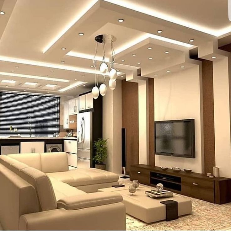 There was a place for a list of awards and a map, which is convenient, the client can immediately assess the location of the hotel and the infrastructure in the area.
Let's also note that when scrolling, the upper strip with the logo is slightly reduced in size. A trifle, but it increases the usable space of the page.
Designed by American studio Tambourine with offices in New York, Bogotá, Fort Lauderdale and Carlsbad.
Tensing Pen
Tensing Pen is located in the resort area of Negril, Jamaica.
The first thing a visitor sees is a video that emphasizes the beauty of the hotel and the resort area as a whole (you can pause the playback and turn off the sound). The menu is located in the upper zone of the page, behind each item there is a drop-down submenu that appears when you hover over it with the cursor. Items are standard - a restaurant, wellness treatments, a gallery, the history of the hotel.
In the menu, mark the item Rooms, it describes each of the rooms of the hotel. Below is the order form. Even lower are blocks with links to sections describing rooms, wellness procedures, and wedding ceremonies.
It's a bit inconvenient that neither the Book Now button form nor the menu is pinned. When scrolling, you have to return to the top of the page.
Designed by Web Connection. The company's offices are located in Phuket and Bangkok (Thailand).
Casa Chameleon
The hotel is located in Costa Rica, in the beach town of Las Catalinas (Guanacaste National Park).
On the main page there is a short video with a demonstration of nature, the interior of the hotel. Basic information about the hotel is divided into several menu items. Also at the top is a form for ordering rooms for a specific date.
Below is some information about the local culture, hotel, leisure activities. 10 useful facts are given - what currency is used, in what language service is available, time zone, climatic features.
The design of the site is a bit inconvenient that the window with a message about discounts and other offers from Casa Chameleon overlaps the menu.
The design of the site was developed by the American studio Hi Werk (Telluride, Colorado).
Round Hill Hotel and Villas
The hotel is located in Montego Bay (Jamaica).
The visitor immediately sees a beautiful video highlighting the local nature. At the top is a traditional menu with basic information about the hotel. The local time and air temperature are displayed above it. On the right side there is a window for booking and links to social networks, you can subscribe to Round Hill accounts. There is no abundance of photos on the main page, materials of this type are placed in the gallery, the design of the site has not suffered from this.
Please note that the hotel quotes room prices immediately. The visitor does not need to wander around the site to find out the price level. At the bottom - contact information and a list of awards.
Website design was developed by Travel Click. This is a large company with 17 offices worldwide, Travel Click has offices in Singapore, New York, Barcelona, Atlanta, Bucharest, Chicago, Dallas, Dubai, Melbourne, Hong Kong, Orlando, Ottawa, Paris, Shanghai.
The Spectator Hotel
The hotel is located in American Charleston (South Carolina).
The menu has been moved to the upper left corner, and the “Reserve” button has been moved to the right. The emphasis in the design of the main page is made on the list of awards received by the hotel and a special attitude towards each client. In the lower part there is a video and a map of the city indicating the hotel.
The color of the “Reserve” button changes depending on the background color. When scrolling the page, it is always visible.
Designed by Tambourine, with offices in New York, Bogota, Fort Lauderdale and Carlsbad.
Katikies Hotel
Greek hotel, Katikies Hotel is located in Santorini.
On the main page - a set of photos (they do not change automatically, but you can scroll through them manually). The menu is hidden in the upper left corner, the “Reserve” button is in the right corner, the color contrasts with the overall color scheme of the site design, the button is clearly visible.
Below is a video and a brief description of each section. In addition to the video, the design uses animation when scrolling the page. Photos from Instagram are also included.
Designed by web studio Mozaik Hospitality with offices in Athens, Chania (Greece), Lausanne (Switzerland), Limassol (Cyprus).
Triple Creek Ranch
The hotel is located in the USA, Darby (Montana).
The location of the main elements is standard. The designers decided not to bore visitors with an abundance of information. Details can be explored through the menu pinned to the top right. The design of the site is light and quite simple.
The site contains several photos that give an idea about the hotel and the style of the rooms, links to the main sections. There is also a text description of the hotel.
At the bottom of the page we see a map of the area superimposed on top of a photo of nature. Looks better than Google maps.
Website design was developed by Lunde Creative. This is an American company, located in the town of Fort Collins (Colorado, USA).
Borgo Egnazia
Italian hotel, located in the small provincial town of Savelletri di Fasano (province of Brindisi).
When you go to the site, the video starts playing, you can skip it. The entire space of the page is divided into 4 parts, each is a link to the corresponding section with information about the hotel. When you hover over any of the parts, the video starts playing.
There is also a traditional navigation through the menu, placed in the upper left corner. It contains information on the restaurant, bar, room types. The booking button is located on the right side of the page.
Meadowood Napa Valley
Another hotel from the USA, located in St. Helin (California, Napa County).
The traditional design is used, the visitor is not overloaded with unnecessary information on the main page. The menu is divided into 2 parts, in the upper left corner there are links to sections describing the restaurant menu, rooms, wines, SPA. In the upper right part of the site - offers from the hotel (wedding ceremonies, conferences, holidays, just relaxing) and a button for booking rooms.
Below are some more beautiful photos with links to relevant sections and a list of Meadowood Napa Valley awards. The site design uses standard solutions.
Post Ranch Inn
Another American hotel located in Big Sur (California).
In the design of the site, we decided to abandon complex elements. There is no horizontal or vertical scrolling, complex animations, an abundance of videos. The main page shows a view of the hotel from above, all the required information is divided into menu items. In the lower part - the possibility of ordering a room for the desired date is implemented.
Drop-down submenus missing when hovering over a menu item. For example, there is a lot of information about a restaurant (about breakfasts, lunches, dinners, wines offered), you have to scroll and manually search for the desired item.
Le Meurice
This French hotel is located in Paris.
The site is very informative. At the top we see the traditional menu, a link to the Le Meurice store and a button for booking rooms for a specific date.
Below is a description of the hotel, urban architecture, a brief excursion into the history of Paris. It shows what feelings a hotel guest can get, a lot of spectacular photos. There is also a map of Paris, you can immediately assess the development of urban infrastructure in the Le Meurice area.
Pop-up forms are used. So, when scrolling, a window appears in which you will be prompted to leave contact details and receive notifications about new hotel offers.
Matetsi Victoria Falls
The hotel is located on the banks of the Zambezi River (near Victoria Falls) in Zimbabwe.
On the main page, 3 photos are replaced with a certain interval. Below is textual information about the hotel and links to videos. The main emphasis is on the visual component, there is little information on the main page. Through the menu, you can get acquainted with other questions of interest to guests. The button for ordering rooms for the desired date is located next to the menu in the upper right corner. There is a small brochure in pdf format, it contains basic information about Matetsi Victoria Falls.
A serious design flaw is the color of the menu and the “Check Availability” button. They are white and merge with the background of light images, this is a design flaw of the site.
Rancho Valencia
Rancho Valencia is located in San Diego (USA, California).
The main page has a compact design. The visitor is not overloaded with information about the history of the hotel, a lot of photos and videos, descriptions of different types of activities. All this is there, but it is located in the corresponding menu items, fixed at the top of the site.
On the right side there is a booking form. Below is a short list of awards and contact information.
Curtain Bluff
The hotel is located in Antigua. In addition to the hotel itself, there is also a SPA salon.
After going to the site, the visitor will see only a photo of the ocean. No inscriptions, buttons and links, only in the upper part - menu items. Below is a form for booking rooms for a given date.
Next - blocks with standard information: a list of possible activities, offers from the restaurant, a description of the beaches. There was a place for video reviews from Instagram, and below them there was a map (Google maps) indicating the location of the hotel.
Compared to the design of competitors' sites, you have to scroll quite a lot, which is inconvenient. In addition, the button for ordering a room is not fixed.
North Block Hotel
American hotel located in the town of Yountville (California).
On the main page, the visitor is greeted with a photo of the hotel's interior and a notification about current promotions. At the time of writing the review, the hotel offers to rent any room for one price.
The menu is hidden behind the corresponding button in the upper right corner. The “Book Now” button is fixed and available on any page of the site. Below is information about the hotel, local spa, restaurant, rooms.
The main feature of the design is the abundance of reviews with photos from Instagram. This shows the visitor the opinion of third-party users about the hotel, and the abundance of photos looks good.
Sol y Luna
Peruvian hotel located in the city of Urubamba. The hotel “catches” with a non-standard approach; when designing the site, the developers tried to maximize the offer of the owners of Sol y Luna.
Key offers of the hotel are located at the top of the site. Here are links to excursions to Machu Picchu, and features of the local restaurant and cuisine in general, and the “Book Now” button. After opening the site, the video automatically starts, and the voice-over tells the story of the hotel.
Almost the entire space of the page is occupied by colorful photos. There are many of them and they make it clear that the guests will have an unforgettable vacation. In the design of the site, the bet was made precisely on this.
Fogo Island Inn
Canadian hotel located in Newfoundland.
Quite an unusual hotel in the "island within an island" format. The design of the site is symmetrical, they tried not to overload the main page with unnecessary information, distributing it by menu items. They have everything - the history of the hotel, how guests can entertain themselves, details about the restaurant and its menu, the design of the hotel from the inside. The “Reserve” button is fixed and does not disappear when switching between pages, scrolling - a good solution.
Unusual solution — the website design provides for the detailing of expenses. It shows where and how much money goes from the full cost of the room.
Palazzo Avino
Italian hotel located in Ravello.
The design of the site is different from most others. All that we see on the main page is a beautiful photo of the hotel and the menu on the left side (it can be hidden).
The menu has everything that users are interested in - a food item in the hotel restaurant, a gallery with an abundance of photos and videos, the history of Palazzo Avino, a room reservation point. The only controversial decision is that the button for booking is not highlighted and is lost among other menu items. Otherwise, the design of the site looks fresh and stands out from the rest.
Gibb's farm
The hotel is located in Tanzania (Karatu).
Symmetrical design in light colors. The main idea of the hotel design is unity with nature, in the design of the site we tried to adhere to the same direction.
The site design is very simple. The menu is fixed at the top, below there are buttons for checking available rooms and reservations. It is a good decision to place the so-called Farm Tails on the main page - interesting stories from the life of the hotel. The site also has reviews from Instagram.
Among the shortcomings of the site's design, let's single out perhaps the not fixed "Booking" button. For the reservation, you will have to scroll the page up each time.
The Mulia Bali
Indonesian hotel located on the island of Bali.
Designers have relied on informativeness, on the main page there is a lot of information about the hotel. The menu was fixed at the top, there was also a place for the number selection button for the desired number.
Provides information on the restaurant, types of activities, special offers from the hotel. In addition to photos, there are also videos, Mulia Bali has its own YouTube channel with a lot of videos, from which you can get an idea of the interior of the hotel.
A light background and a contrasting font are used, the text is easy to read. Due to the fact that the “Check Availability” button is highlighted in color and always in sight, the path of a potential client to making a reservation is shortened.
Royal Mansour
The hotel is located in Marrakesh (Morocco).
The design uses pop-up forms to inform the visitor about the benefits of booking rooms in advance. Immediately after going to the site, a video is launched showing the beauty of the hotel.
The start page will have to scroll quite deeply - it contains a lot of information. There are no problems with the perception of information, the font is chosen well, the photos organically fit into the design of the site. It is also possible to navigate through the menu items pinned to the top of the page.
The "Book Now" button could have been made more visible. It is fixed on the page, but it almost does not stand out from the rest of the menu items.
Turtle Island
The hotel is located on Turtle Island (Fiji).
The design uses a minimum of elements, on the main page there is neither an abundance of animation nor video. Only a photo of the surf and a short digression into the history of the island and the hotel itself.
More information can be found in the corresponding menu items. Information is given on the design of rooms, offers from the restaurant and other details. There is also a gallery with lots of photos.
The design is even unnecessarily simple. There is a lack of a separate menu or button for booking a room, it would be possible to diversify the text with a large number of photos or videos.
Koh Yao Noi Hotel
The hotel is located in the Thai province of Phang Nga.
Given the location of the hotel, it is logical that the emphasis is on the unity of man and nature. On the site, in addition to describing the hotel itself, there was a place for information about rare species of animals with a call to protect them.
In addition to photos and videos (starts immediately after going to the site), the design uses hand-drawn stylized pictures, which adds charm. The hotel is not positioned as a pretentious hotel, so such elements are appropriate.
Navigation is convenient, the menu is always fixed and you don't have to look for it when scrolling. The Book Now button is highlighted in color and is also always available.
Tierra Patagonia
Chilean hotel located in Torres del Paine (Patagonia).
The visitor is greeted by a magnificent photo with a general view of the hotel against the backdrop of mountains and the night sky. The designers also placed a badge here, announcing that the Tierra Patagonia hotel received an award from Travel + Leisure.
Below is a series of blocks with beautiful photos and a short description of the hotel's features (restaurant, SPA, types of activities). Each of the blocks is clickable, you can study the direction of interest in more detail.
Note the handwritten map of the area. It looks good, refreshes the design against the background of spectacular photos that are standard for most hotels.
The menu and the “Book your trip” button are always available, but do not draw attention to themselves and do not take up much space.
Ellerman House
The hotel is located in Cape Town (South Africa).
Preference was given to a light asymmetrical site design. The visitor is immediately offered to watch a video about Ellerman House or see a photo in the gallery.
In addition to the standard blocks with room descriptions, the emphasis is on the unique features of the hotel - its own small art gallery, wine collection, restaurant.
The top line is dedicated to booking rooms for the desired date, the visitor sees it no matter what page he is on.
The highlight of the site's design is a city map reminiscent of hand maps from the early 20th century. Moreover, you can switch between the usual Google maps and this styling.
Hotel Matilda
Mexican hotel located in San Miguel de Allende.
On the site we see a traditional solution in the form of a menu fixed in the upper right corner (booking is made through it) and several successive photos on the main page.
Below, in addition to links to various sections of the site, it is emphasized that the hotel has its own collection of art objects, so that visitors can not only relax, but also join the beauty. Below is a map and a form for signing up for a newsletter from the hotel.
There is a button to quickly return to the top of the page.
Conclusion
Although the design of hotel websites differs, general trends can be traced. These include:
- fixing the menu and buttons for booking at the top of the page or on the side;
- abundance of photos - found in the vast majority of cases;
- quality navigation. Even if there is a lot of information, on the main page of a potential client they try not to overload it. It is distributed on the menu, and on the main page they leave something as spectacular as possible, something that immediately attracts the eye of a person.
The rest is up to the designer. There are many ways to attract the attention of the visitor, if you add storytelling to this and correctly present the advantages of the hotel, the client is highly likely to leave a request for booking a room.
The examples listed above do not need to be 100% copied. Use them as a base and on this basis try to create your own version of the site design.
7 designer hotels in Europe • Interior+Design
“I interpret a hotel as a place to escape from reality. A sort of heaven on earth, where life is simplified to the limit,” says designer Francois Champsor. The author's choice comes first. Hotel chains and entrepreneurs are betting on exceptional design and personal service that may keep us from looking for temporary heaven on airbnb.
Related: Leman Locke: Aparthotel in London
Hotel Santa Clara 1728, Lisbon. Reconstruction architect Manuel Aires Mateus.
What happened to European urbain hotels in 2017? Bruno Moinard and his team completed two predictably luxurious chain projects at once - Hotel Eden (The Dorchester Collection) in Rome and Four Seasons Hotel in London . Nobu Shoreditch opened its doors in the British capital. Ron Arad and Ben Adams tried to combine "Japanese aesthetics with foie gras" in the spirit of the restaurant of the same name in the trendy Shoreditch district. After an £80 million renovation, the Royal Lancaster London has been given a new look. Concept and design created by London-based Studio Proof. Viu opened in Milan, designed by Arassociati and Nicola Galicia as Molteni&C catalog with remakes by Gio Ponti.
Nobu Shoreditch. Authors: Ron Arad and Ben Adams.
Amsterdam-based concrete designed the interiors of Roomers in Munich in brass, leather and black marble. And in Amsterdam itself, the luck of Alex Michaelis and Tim Boyd is Kimpton De Witt. Danmark opened in Copenhagen, designed by architect and designer Morten Hedegaard. Like most new establishments, the hotel is imbued with mix&mutch spirit and mid-century modern aesthetics. Romantic and original hotel Santa Clara 1728 - in Lisbon (architect Manuel Aires Mateus). In Barcelona we can recommend The One , designed by the emotional Chilean Jaime Beriestain.
Hotel Roomers in Munich. The interiors were designed by the Amsterdam-based concrete.
Paris offers a dozen novelties of the year: Hoxton with rooms from the fashion duo Humbert & Poyet, Au Boeuf Couronné, the brainchild of designer Fabrice Osset, BOB and SNOB - ironic glamor from Agence Desjeux Delaye, Andrien Gloagen's cute Hotel Bienvenue with Studio Chloé Nègre decor. Patrick Norge continues to create budget suites for Okko Hotels. The stellar debut of Ora-Ito and conceptual artist Daniel Buren created YOOMA Urban Lodge, an address for millennials and trippers with affordable prices and the ability to accommodate a large group. The bright resort Le Bailli de Suffren, a hotel in Saint-Tropez, was completed by François Champsor...
A shortlist from INTERIOR+DESIGN will help you "escape from reality" in winter. Seven best of two dozen hotels in 2017.
1. Copenhagen, Denmark. Nobis Copenhagen/Wingårdh Arkitekter
According to Alessandro Catenacci, CEO of Nobis Hospitality Group, the design is based on a new definition of luxury.
“Danish classicism, of which the hotel building is an excellent example, is more complex than Swedish. We were delicate...,” says the architect.
All rooms have high ceilings with stucco, floor-to-ceiling windows and parquet. The furniture is by the Danish brand Carl Hansen & Søn, the carpets are by the Swedish brand Kasthall, and the bathrooms are decorated with Bardiglio Nuvolato marble.
The 5,500 square meter hotel has 77 rooms and three suites.
The 1903 building was previously occupied by the Royal Danish Conservatory.
Subdued blues and greens in the palette of northern nature create a calm mood.
A harmonious mix made it possible to create high-quality materials - natural marble and oak, copper and glass.
Related: Gert Wingord: Swedish hotel in the Danish capital
In September 2017, Nobis opened its first hotel outside of Stockholm. It is located next to the Tivoli Park in a historical monument - the former building of the Royal Conservatory. 5500 square meters, 77 rooms and three suites. A master class on timeless interiors was presented here by the famous Swedish architect Gert Wingård and his team Wingårdh Arkitekter. The hotel is conceived as comfortable and friendly, but free from all unnecessary and artificial. High-quality materials (natural marble, oak, copper) and works of author's design - fashionable lamps by Michael Anastassiades, classic XX century chairs and armchairs by Hans Wegner, Danish crystal by Frederik Bagger create a timeless atmosphere. From 350 euros.
2. Stockholm, Sweden. At Six/Universal Design Studio
On the steps of the main staircase, guests are greeted by a marble female head (height 2.5 m), created by the Catalan artist Jaume Plensa. The railings are hand-covered with leather.
One of the At Six rooms. Mirrors opposite each other visually enlarge the space.
One of the two restaurants in the hotel.
The sofa area of the Presidential Suite with the work of photographer Bjorn Davidsson (Dawid).
Related: Universal Design Studio: Contemporary Art at the At Six Hotel
The pride of At Six is the strongest collection of contemporary art curated by Sune Nordgren. The renovated rooms and public areas feature works by Olafur Eliasson, Julian Opie, Saul Levitt, Richard Long, Spencer Finch, Tasita Dean, Marika Van Warmerdam, Christina Matusz, as well as photographs by Bjorn Davidsson (Dawid). In the wine bar, you can see a unique table carved from a whole elm trunk by the Swedish artist Lis-Marie Hoffmann. The building was built as a hotel, but for many years it was occupied by the headquarters of a large bank. London architects from Universal Design Studio needed to create a modern hotel - a new point of attraction for tourists and fashionable public. The already tall building was increased by three floors: the hotel has 343 rooms of different classes, a penthouse with a terrace and windows on three sides at once. From 150 euros.
3. Bergen, Norway. Bergen Børs/Claesson Koivisto Rune
Architects call eccentricity and magic an important part of their rational design process.
The walls of the hotel remember the time when deals and business negotiations were not completed by email, but by a blow of a hammer and a handshake.
The old Bergen Stock Exchange, designed by the architect F. W. Schirtz, opened in 1862 and was rebuilt in the Neo-Renaissance style around 1890-1893 Stained-glass bay windows of this period have been preserved.
The Norwegian "Bergen-Burse" has 127 rooms.
Bergen Børs prefers not to use the term "luxury", instead referring to elegance, dignity and discretion.
Related: Claesson Koivisto Rune: a hotel instead of the old stock exchange
The newest hotel of the De Bergenske group occupies three buildings at once: the Norwegian Stock Exchange, built in 1862, and two banks (1890 and 1967). The buildings have preserved ancient coffered ceilings, parquet floors, multi-colored stained-glass windows and even soundproof doors. The restaurant is adorned with a bust of the former CEO of the stock exchange. Architect Eero Koivisto, Claesson Koivisto Rune says that when working on the interior, designers were looking for things that were timeless and trendy. And they used tricks to emphasize the historical value of the place. For example, the mirror tile that lined the walls in the bar was cut so that it exactly matched the format of the surviving century-old wooden panels. From 120 euros. For December 30, 31 and January 1, all rooms are already booked.
4. Paris, France. Hôtel de Crillon
The majestic complex on the Place de la Concorde began to be built under Louis XV. The palace, where the hotel is located today, was designed by Louis-Francois Troires. Since 1788, it has become the residence for several generations of the noble de Crillon family.
Exclusively for Les Grands Appartements, custom-made furniture, crystal chandeliers, hand-decorated boiserie. Decorated by Karl Lagerfeld.
Choupette. Lagerfeld dedicated the decor to his beloved kitty. All rooms designed by Karl Lagerfeld can be combined upon request. And then there will be a grandiose luxurious space with a total area of 335 square meters. m.
m.
The hotel has 78 rooms, 36 suites and 10 signature suites. The largest room has an area of 245 sq. m plus two terraces of 100 sq. m.
Related: Hôtel de Crillon: the most luxurious hotel in Paris
The legendary Hôtel de Crillon opened in the summer after a four-year renovation at a cost of 455 million euros. Its revival became a discussed event in the social life of Paris. The owners of the Rosewood Group entrusted the reconstruction to the first names of the French design scene. Two suites were designed by Karl Lagerfeld and are called Les Grands Appartements. Participated Tristan Oher, master of exquisite palette and connoisseur of antiques Shahan Minassian, architect Cyril Vergnol. The overall direction was provided by architect Richard Martinet and art director Aline Asmar d'Amman. Landscape guru Louis Benes had a hand in landscaping terraces and courtyards. The furnishings include antiques, as well as items made to order according to the sketches of the authors of the project. Chandeliers were made by masters Baccarat, antique lamps, preserved in the hotel from the old days, were restored by Maison Lucien Gau bronzers. From 1300 euros.
5. Paris, France. Hôtel National des Arts et Métiers/Raphael Navot
The walls of the restaurant La Cicchetteria are decorated with a sculptural composition of hundreds of metal pipes (oxidized copper) and paneled with this material.
In the hotel's main restaurant, le Ristorante, artist Gael Davranche transformed acoustic panels into decorative panels.
On the terrace - Palissade chairs, diz. E. and R. Bouroullec for Hay.
Penthouse interiors of 100 sq. meters. The worktop and backsplash are finished in terrazzo. A similar coating was used in the corridor.
Vintage Thonet chairs sit alongside Armada chairs designed by Doshi & Levien for Moroso and lamps by Bernard-Albin Gras, DCW Editions.
Related: Rafael Navot: The hotel where F. F. Coppola stays
The hotel occupies two adjacent Ottoman buildings. The interiors were designed by Rafael Navot, designer of David Lynch's Silencio Club. Four-star comfort, excellent Italian cuisine and Oscar Quagliarini cocktails have already managed to seduce many difficult guests. Black marble, raw wood, oxidized copper, hand-painted immediately speak of an extraordinary approach to hotel decor. Navot brought in cabinetmakers Oscar Ono, Signature Murale and Pierre & Granite, and restorers from Patrimoine Pierre de Taille. The designer also carefully selected the objects: the main restaurant is furnished with vintage Tatra chairs (Antonin Schuman for Thonet, 1950s). Patios and terraces with sofas and poufs by Paola Navone for Gervasoni. From 250 euros.
6. London, UK. Henrietta Hotel/Dorotea Meilichsohn
Headboard solution individually in each hotel room.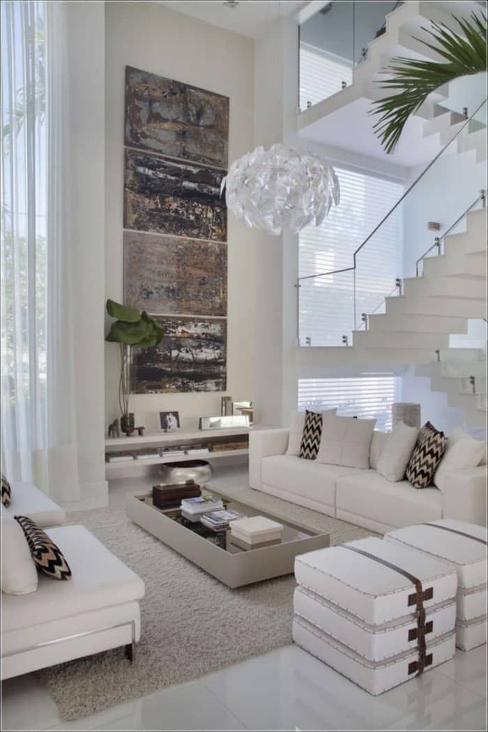 Dorothea Meilihzon created the textile pattern herself.
The hinged doors between the bathroom and the living area received glass finials, reminiscent of classic desudéportes.
The design of some headboards in a very free, but still neoclassical spirit, prompted by the design of window openings and door portals.
The organization of the sink area, as conceived by the designer, should be reminiscent of small fountains.
The color scheme was selected individually for each of the 18 rooms.
For all its brightness and boldness, the new hotel is imbued with the spirit of the historic district.
Related: Henrietta Hotel. Secrets of Fashionable Decor by Dorothea Meilichson
This is the first Experimental Group facility of its kind in the British capital. For the author of interiors, the founder of the Chzon studio, young Dorothea Meilichzon, this is also the first project in London.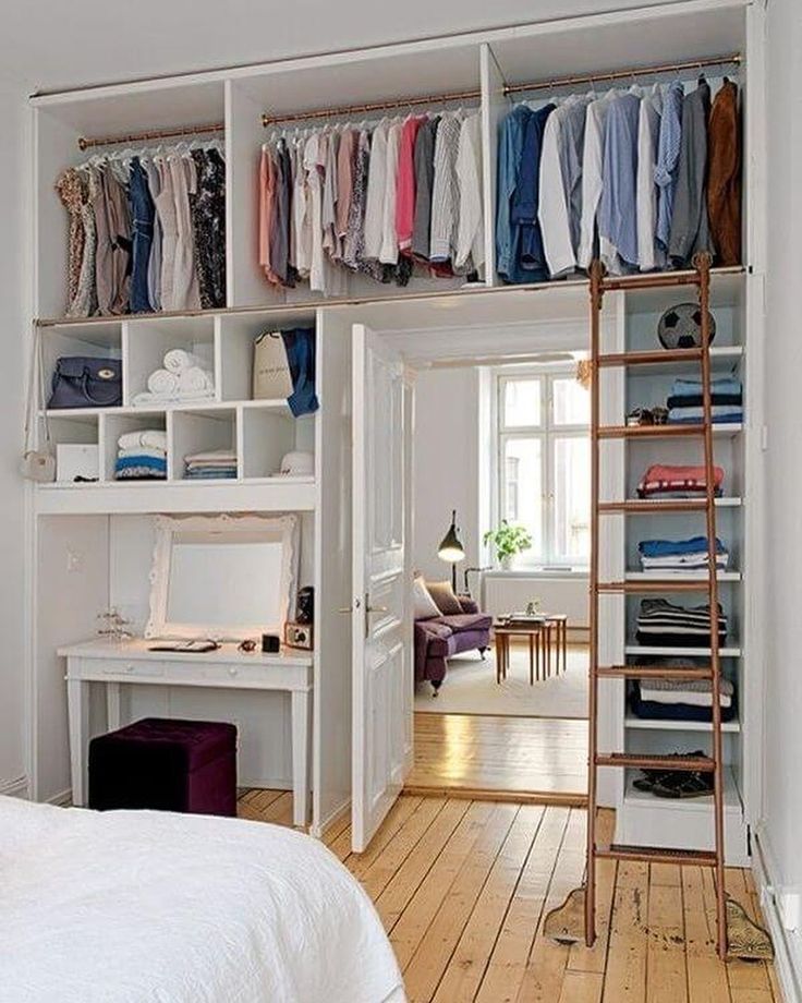 The small hotel has only 18 rooms and a restaurant with 80 seats. “I always try to build on the architecture of the area. The street itself served as a source of inspiration for me,” the designer tells us. “The flat facades characteristic of Covent Garden development with active, very diverse architraves and endings suggested exaggeratedly high, embossed headboards.” A variety of strong author's techniques and objects, complex color combinations (each of the 18 rooms has its own color scheme) and active plastic solutions create a very rich and emotional environment in the spirit of the mid-century, bold enough for a hotel, but akin to the historical district. Eliza Doolittle, who has left the flower business in these streets and settled down, would love it... From 280 euros.
7. Madrid, Spain. Barcelo Torre de Madrid/Jaime Hayon
Chairs from the Gardenias collection created by Jaime Hayon for the Catalan brand BD Barcelona Design are paired with tables from his Reaction Poetique collection for Cassina inspired by Le Corbusier.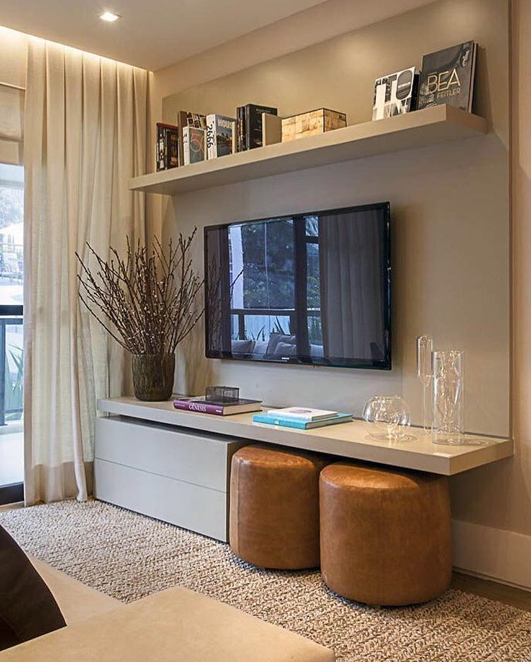
A special attraction of the hotel is the showcase bar, one of the highest in Madrid. The main motif in its design is the Roman arch.
The mirror above the bed was designed by Jaime Hayon and replicates his favorite mask motif. Table in the form of a monkey from the Gardenias collection, BD Barcelona Design. Armchair - Fritz Hansen.
Lobby decorated with Fritz Hansen furniture and Chinoz lamps by Parachilna on the windowsill.
The Fritz Hansen upholstered furniture is complemented by the Palette tables by &Tradition, whose shape was inspired by the works of the famous sculptor Alexander Calder to Jaime Hayon.
The bear, the heraldic symbol of Madrid, is sculpted in the characteristic black and white that Jaime Hayon likes to use for his ceramic vases and art objects.
Related: Hotel Barcelo Torre de Madrid: redesigned by Jaime Hayon
The renovated design hotel with 258 rooms occupies 9 floors of one of the tallest buildings in the city.